
Don't fret the big stuff. Via Getty
The Candlestick: Inflation, The Fed, Macro Moves and Data Dumps… these things concern not The Zen Student of the Trend
Experts
Don't fret the big stuff. Via Getty
Experts
Carl Capolingua likes to ThinkMarkets.
He’s been doing so much of it that, in fact, he wrote a book, compiled (incredibly) over the last few years, despite the fact that I’ve been working with him during that time at least and the man surely has no more small, spare precious seconds to read, let alone write.
Whatevs. It’s called Bear Market Survival Guide eBook.
I don’t see why I shouldn’t give it a plug. My editor will probably erase this because of the 25-year war he’s been waging on words, but I read it (the book: it’s free, so I’m in) and it’s great and not just ‘cos Capo’s great.
Okay, yes. The title might need a bit of the Stockhead touch, (I suggest Stockhead’s sexy survival of a Bear Market attack book. Yeah also it’s a guide and eBook hashtag stocks dot com …but it’s hella timely, incredibly practical, straight shooting and walks one past the nonsense and into the house of doing stuff – like short selling Coles and Woolies, which I’ve always wanted to do.
So there. Capo’s Bear Market Survival Guide eBook.
In this shocking episode of The Candlestick, I thought we’d do a quick tour in charts of some of the key global themes impacting financial markets, and then drill down locally to see which sectors and stocks find themselves in the right place at the right time… and which are hapless deers in the headlights!
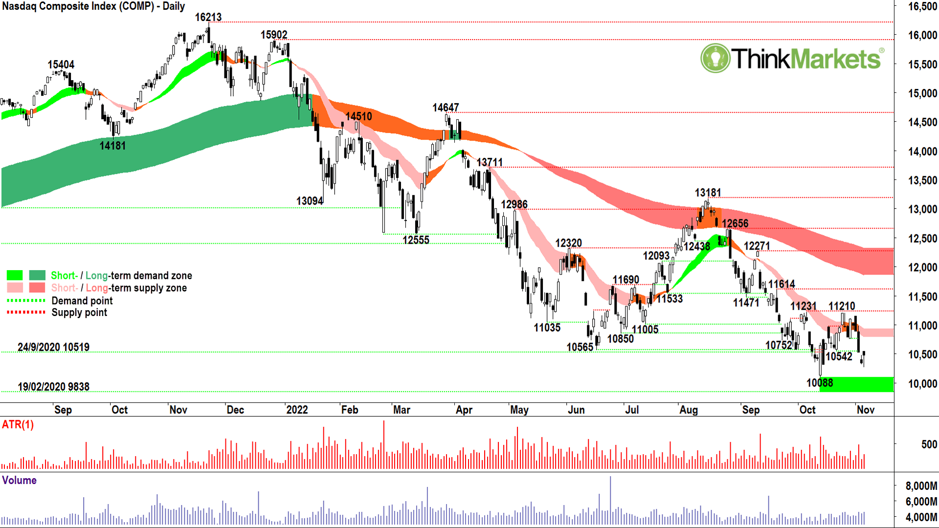
Let’s open with the world’s premier risk-on equities index, the COMP.
If you’re not familiar with the term “risk-on” or its counterpart “risk-off” then you’ve probably not been white-knuckling markets for the last 12 months. … risk-on-off, it’s all market analysts like me want to talk about!
Risk-on refers to everything going gangbusters. Economies are growing, everyone has a job, stuff is cheap to buy because there’s very little inflation, and evil central bankers aren’t jacking up rates to squeeze every last discretionary penny from our wallets. Most importantly for stocks, earnings are growing at a strong clip.
Risk-off, well that’s just the opposite of everything above…ergo: the exact situation we have right now! Insert crying face emoji.
For most of October, markets had been channelling their very best risk-on vibes. Major global indices like the Dow Jones Industrial Average (DJIA) and our local S&P ASX200 (XJO) enjoyed near-vertical rallies of 15% and 9.3% from their respective lows.
Enter one Fed Chair Jerome Powell (cue Darth Vader Imperial March and asthmatic breathing).
Again, for your non-market watchers, JP is the chairman of the US Federal Reserve, the chief body responsible for setting the cost of money in America.
Financially, the US is still the world’s most important economy, and the US Dollar its most important currency. So, what JP and the Fed does is a bit of a big deal. The cost of money is determined by the interest rate the Fed charges the big US banks.
If JP thinks money is too cheap, and he wants to make it harder and more expensive for us to get our hands on it to spend it, he jacks up interest rates.
His grand thesis is: If we stop spending so much money, stuff won’t keep going up in price so much, and that will ultimately be good for everyone.
This is exactly what he’s doing right now. Administering a nasty dose of medicine which he believes the US economy needs to survive. Lowly consumers don’t like it, and because it reduces spending and company earnings (via increased borrowing costs and a bunch of other negative impacts), it hurts the stock market.
For some reason, there was a bit of surprise, shock, dismay, and horror in markets this week after JP’s recent decision to increase US interest rates by another 0.75%. Then, in his speech explaining why, JP told us to expect more medicine to come! Bleh… yuk!
Whilst there was plenty of surprise out there, this little black duck was totally Zen, despite the ensuing carnage on markets. This is because I am a student of the trend, which was down before JP’s speech, and still was after his speech. Business as usual.
It’s funny how macro stuff like JP’s speech tends to confirm the trend more often than changing it. Not to say the macro won’t eventually change the trend – it will, but this chart indicates not before a whole heap of bad stuff is probably going to happen! And insert screaming face emoji!
The long-term downtrend ribbon (dark-pink zone) remains firmly fixed entrenched. The last rally on the COMP, whilst a not insubstantial 11%, wasn’t much more than a blip within the context of the broader downtrend. Note also, the reliability of the short-term downtrend ribbon (light-pink zone) in resisting upwards price movement.
Supply-side candles in the short-term downtrend ribbon are usually a precursor to a resumption of the broader downtrend, and this time was no different. Note in particular the particularly nasty, black-bodied showings on 1 and 2 November!
The price action is back to lower peaks and lower troughs which indicates building supply and diminishing demand.
10,088 is likely to provide some resistance to further falls, but if this last level of potential demand goes off, the 19 February 2020 low of 9838 beckons.
View: Bearish until a close above 11,210, possibly back to neutral there, but couldn’t contemplate a bullish bias until a close above the long-term trend ribbon.
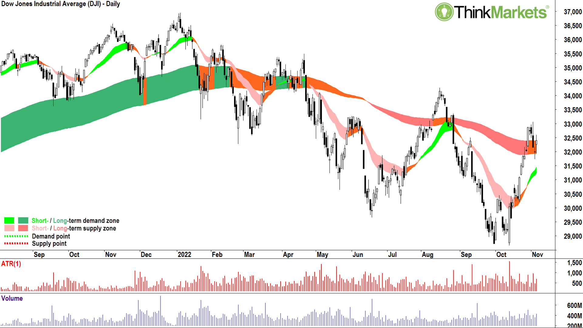
The reason for the confusion among investors is this chart (and to a lesser extent the S&P500 not shown).
The DJIA is dominated by 30 value-based and defensive plays like Coke, McDonald’s, United Health, Honeywell, and stalwart financials like Goldman Sachs and JP Morgan etc. Each of these stocks has been super-strong since the October low (check out the chart of McDonald’s 🚀🚀🚀).
Question: Why the strength here when it seems the Fed is on a mission to derail the US economy?
Answer: These are the stocks you go to in a crisis!
But why would you buy anything in a crisis, I hear you ask?
Well, it just happens Stockhead Deputy Ed and my grammatical nemesis Christian Edwards, his photoshop wielding editor Peter F and Mark Gardner at Maqro Capital describe this pretty well here, – moreover, despite JP’s mission to ramp up the cost of money, there’s still an unquantifiable amount of it sloshing around in the States.
Ironically, it was JP and his predecessors who created that exact same money which ultimately led us to the current crisis – but that’s a story for another time!
I guess irony can be pretty ironic, sometimes:
Anyways, this money, and new money which keeps rolling into big pension funds (because so many are employed and are beavering away saving for their retirements) still must be invested somewhere. Much of it goes into bonds, some of it stays in cash, but a big whack (typically around 40-60 per cent) is benchmarked for equities.
What I’m kinda saying here is: Demand is ubiquitous. Bull market, bear market, or otherwise, it’s always there.
And when there’s little supply, because the bad news stops for a while, the path of least resistance generally is up.
Markets enjoyed a supply vacuum after those October lows where an absence of bad news (largely from the Fed) allowed only the most liquid and defensive stocks to enjoy that ubiquitous demand.
The big funds had to buy something, so they stuck with stuff they know is going to be around through and after the cycle, and which is big enough and liquid enough they can probably get out of if they really needed to.
Another impact of this concentrated buying is, these stocks are big, and they have big weightings in the major indices. This means stacking on fat index points. When the index goes up, all ships get the benefit of the rising tide as passive index funds must follow the leaders and buy. Basically, you get a few stocks bench-pressing the rest of the market.
This is what technical analysts call a “narrow market breadth”. It’s usually a good sign that a rally is going to be short-lived. So, for me, watching the COMP not rally as much is extremely telling. Rather than the 30 biggest and most defensive blue chips of the DJIA, the COMP represents over 3,700 US companies of all shapes and sizes, many of which are skewed towards high-growth technology and consumer related sectors.
The DJIA and COMP charts highlight just how tricky things are for investors right now. They’re getting pushed and pulled in two directions.
Investors must decide who to trust. Value or growth? Ultimately stocks live and die by growth, so my tip is: place more emphasis on the COMP than the DJIA!
View: Neutral, need to see a break and hold above long-term downtrend ribbon, followed by a close above 33,072 or potentially even 34,282 for confirmation, to return to a bullish bias. Bearish bias on a close below 30,206.
Growth starts here (and in the Dr Copper chart not shown this week but discussed in previous editions .
Until this and the chart of the other industrial metals turns up, I can’t get too bullish on prospects for the global economy, and drawing the line out, for the Australian economy, and stocks. My major concern, as in the thing which keeps me awake at night, is any upturn is likely a very long way down the track. Inflation, pandemic, supply chain shortages, war (real and trade), and higher interest rates causing economies to contract and unemployment to rise.
It’s not the right time to be drinking the risk-on Kool-Aid.
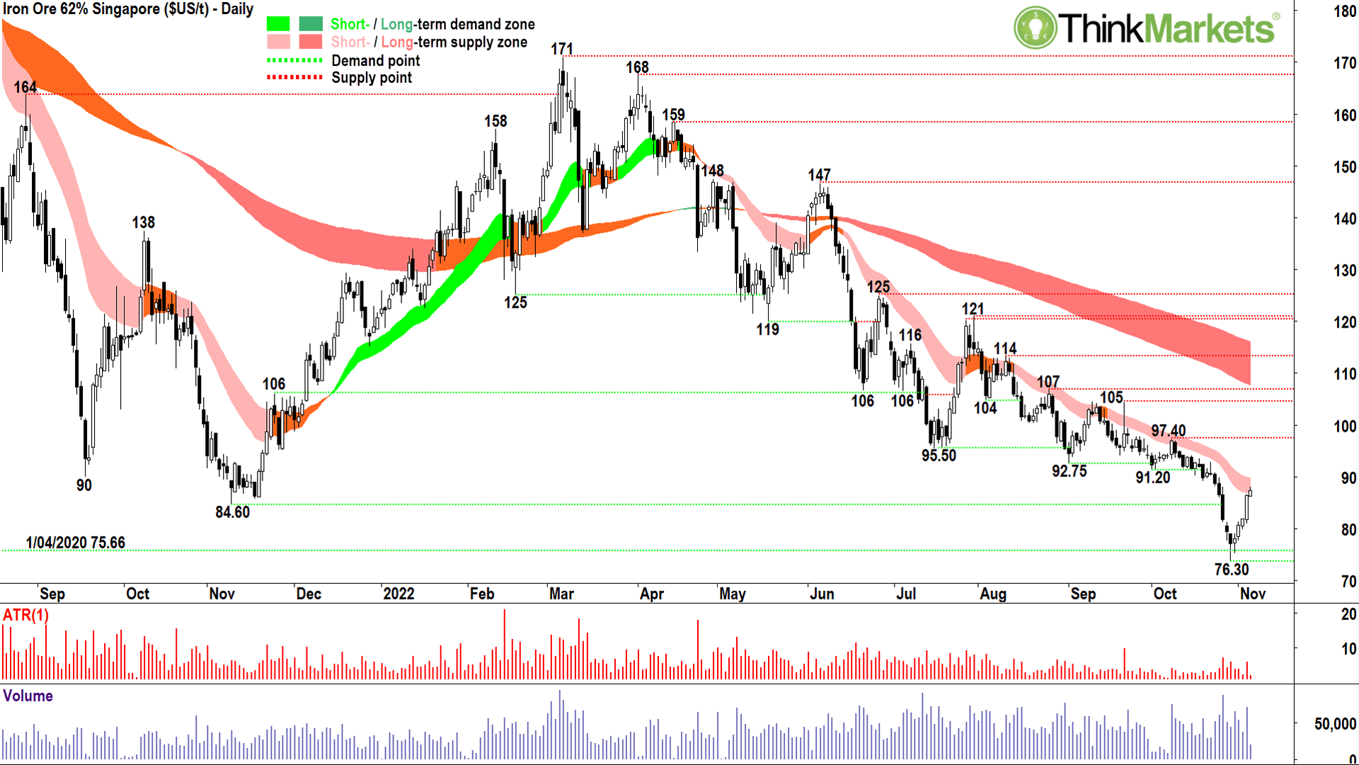
More specifically for iron ore (and the likes of BHP, RIO, FMG et al) China is a total basket case. We got through the GFC largely because China put the foot down and kept spending and consuming. I can’t see this happening this time (nor any other major economic power having the capacity to ride to the rescue either).
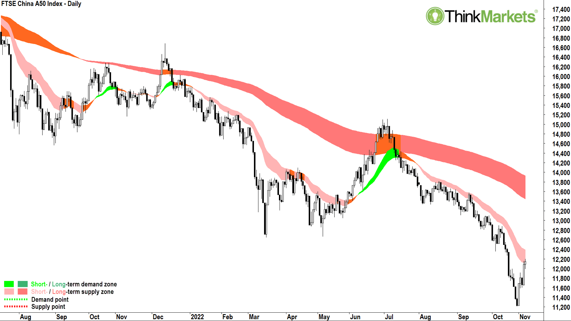
The Chinese stock market is telling you this, case in point, the FTSE China A Shares Index above. This is a chart burdened by a zombie property sector, Beijing’s crackdowns on speculative investment in the technology and real estate sectors, massive state and municipal debt, a growing trade war with the US, and of course their belligerent commitment to a zero Covid policy (false rumours aside).
I could expand on the dire situation in any one of these topics (15-year lows on the Yuan vs massive US denominated debt exposure is one candidate!), but for iron ore specifically, all the above contributes to very constricted demand for steel. I saw a stat today from the China Iron Ore and Steel Association (CISA) noting it has received reports indicating 80% of China’s steel mills are losing money.
So far, there’s been little reaction from our major resources stocks, but personally, I question how long they have until the you know what with respect to China hits the fan.
View: Bearish until a close above 105.
Concerned?
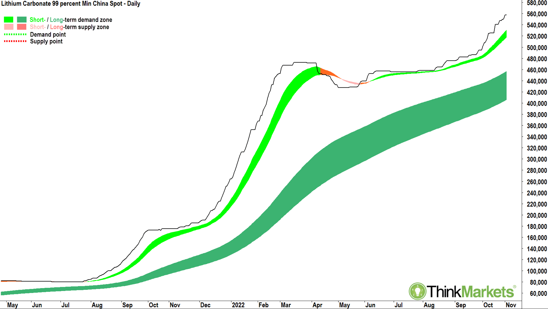
On balance, I think you should be. But there is one bright spark amidst the doom and gloom. “Structural shift”. I know you’ve heard that old chestnut before, it usually gets bandied around soon before a crash. But I must say, this trend looks invincible for the time being. Got to love lithium!
The world is still trying to get its hands on as much of this stuff as possible. It’s super tough to access long-term data on many of the lithium mineral contracts, spodumene concentrate being the main one for many Australian producers, but they all pretty much look the same as this one. Bottom-left-top-right.
Check these charts out on your own time, but based upon the technical scan I ran this morning here are a few names which caught my eye: ACDC ETF, Galan Lithium (ASX:GLN) and Green Technology Metals (ASX:GT1).
All charts, no fundamentals, so do your own research.
Running my eye over the rest of the charts in the sector, almost all look very solid. Long-term uptrends intact, and generally constructive candles and price action. No issues holding the likes of Allkem (ASX:AKE), Pilbara Minerals (ASX:PLS), IGO, Mineral Resources (ASX:MIN), Core Lithium (ASX:CXO), and Liontown Resources (ASX:LTR) for now.
View: Bullish until a close below 427,500.
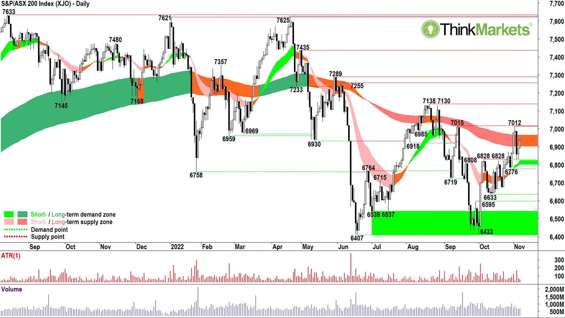
Fortunately for local investors, our index has moved more like the DJIA than the COMP. Energy, resources (helped by the weaker Australian dollar amidst weak commodity prices), and banks. These three sectors have helped us reinstate a short-term uptrend ribbon (light-green zone) and even helped us mount a challenge of the long-term downtrend ribbon.
I’ve said many times, I don’t get bullish on stuff until it at least trades above it’s long-term downtrend ribbon, and this is not far away. So, I’m happy to investigate some strategic plays with some idle cash here – but given the broader uncertainty outlined in above, I prefer to maintain higher than benchmark cash levels (typical benchmark cash for a fund manager is around 10%).
View: Neutral, need to see a break and hold above long-term downtrend ribbon, followed by a close above 7012 or potentially even 7130 for confirmation, to return to a bullish bias. Bearish bias on a close below 6633.
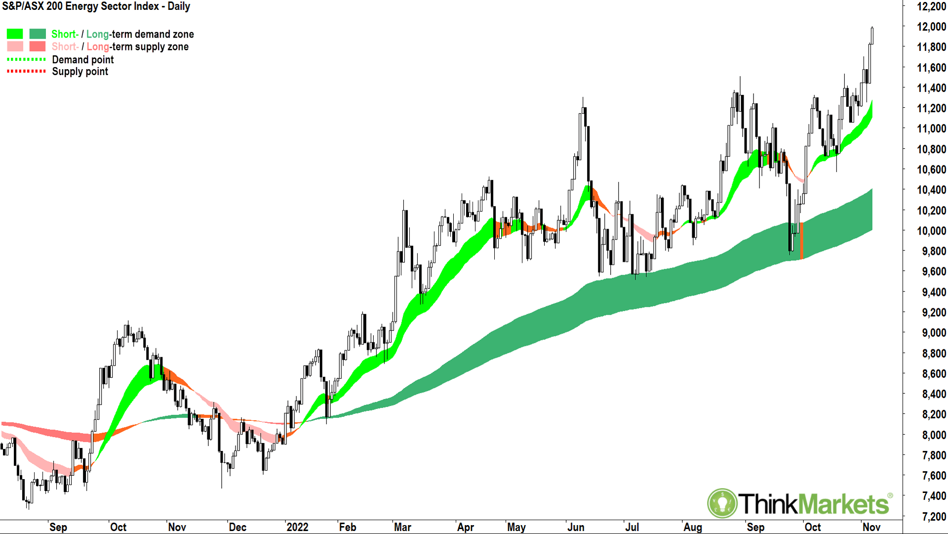
A nice segue into this chart. A logical place to put some of that idle cash to work.
The XEJ is the best sector index chart by a long way.
I get it’s a crowded trade, I get crowded trades sometimes unravel quickly when whatever caused the crowding suddenly reverses, but the trend is so good here I think you can stick with it.
My fave’s in the sector are ones you probably already know, Woodside Energy (ASX:WDS), Karoon Energy (ASX:KAR), and even Santos (ASX:STO) is looking good (the worst of the bunch and one I’ve been bearish on in the past). Other companies which service the producers like MMA Offshore (MRM), Worley (WOR), and Monadelphous Group (MND) also look very solid on their charts.
View: Bullish until a close below 9,510.
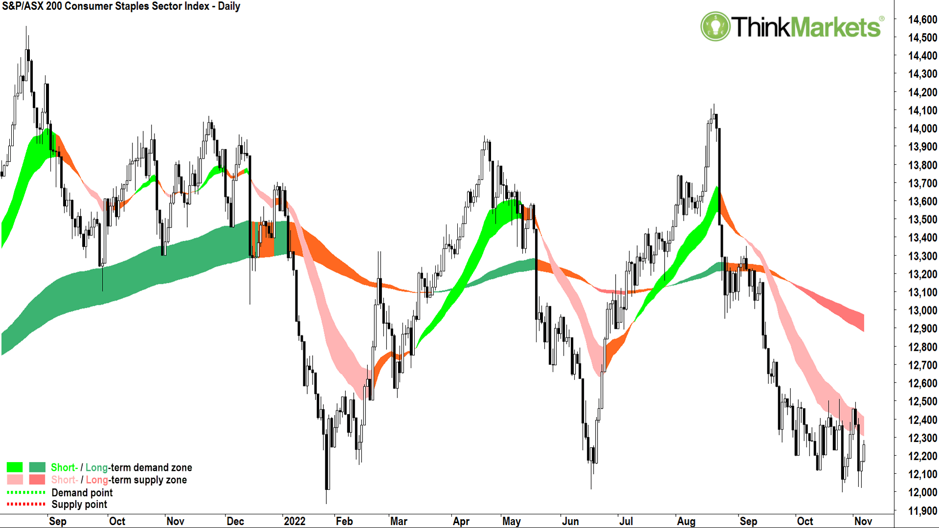
For some reason, defensive sectors locally have done the opposite of those in the US. Two of the worst performing local sectors are Healthcare (basically the CSL index!) and Consumer Staples. Staples is the worst looking of the two, so I bring it to your attention today. My concern is the chart above appears close to breaking below a tried-and-true trading range between 12,000 and 14,000.
Those investors still holding onto household portfolio stuffers like Coles (ASX:COL), Woolworths (ASX:WOW), and Endeavour Group (ASX:EDV) might want to watch them very closely. As a trend follower, I couldn’t own any of them due to the prevalence of short- and long-term downtrends.
If you’re not in them, another option is to look for short sells in this sector.
I discuss short selling and several other bear market strategies in my Bear Market Survival Guide eBook.*
View: Bearish until a close above at least 12,600.
Read the book.
Candlestick out!
*(Ed: I already told ’em Capo)


Get the latest Stockhead news delivered free to your inbox.