
To the charts! Via Getty
The Candlestick: The bad news is this ship is taking water, the good news is we’re totally in Charted Territory
Experts
To the charts! Via Getty
Experts
Carl Capolingua is the most precious Australian technical analyst you will meet in this story.
He works by candlelight at ThinkMarkets and in this highly exclusive series, The Candlestick, Capo flexes a few mathematical muscles into the unknowable iterations of markets – global, local, individual.
Here he is in the flesh, impossible to chart:

Morning all.
To work!
It’s been a little while since my last update, but it turns out, not much has changed in terms of what is driving markets. It’s still all about how high interest rates must go before the Federal Reserve (“The Fed”) in the USA slows down (don’t even talk about it stopping!), versus how much damage its policy is going to do to the global economy.
As far as stock prices are concerned, investors are drawing the line from higher interest rates to lower company profits, and therefore to lower stock prices.
The reason why stocks are falling is two-fold (okay, there are many reasons, but here are the two major ones):
1. Higher rates negatively impacts consumption and increases borrowing costs for companies (plus the inflation which caused the interest rate hikes in the first place is doing much the same thing…so there’s a double whammy at play here). Quite literally, the proverbial bottom line is higher costs vs lower revenues equals lower company profits, and lower company profits equals lower stock prices.
2. Rapid and poorly anticipated events such as the current bout of rate hikes elevates uncertainty across the entire financial system, i.e., the risks of something within the system “breaking” increases. In the past, when things have “broken”, we’ve seen liquidity crises, mass company bankruptcies, household and sovereign debt crises etc. This is when corrections can turn into crashes very quickly.
Overarching each of these two themes, rapid and unanticipated events in markets more generally increase the cost of risk taking. This is because obtaining the liquidity required to pump asset prices back up costs more (it demands a higher return for the elevated prevailing risks). Money seeks the sidelines (i.e., cash) where it should be relatively safe while the savvy investors who own it ride out any “this time” crises.
In bitesize: Interest rates have gone up too far, too fast, and we’re not sure where or when they’re going to land. Savvy investors are choosing to hold fewer risk assets like stocks as they switch to cash. Risk assets need to be severely discounted (i.e., by ways of lower prices) to entice this cash back out to play.
Hey, this is not the first time it’s happened. It’s not even the first time rapidly rising interest rates are the cause of a potential breakage. So then, why and how do so many investors get caught off guard when events such as those we’ve experienced over the last 12 months occur?
It appears, generations of investors keep making the same mistakes over and again.
Let me offer a reason: Not all investors use charts to guide their investing decisions!
The current macroeconomic environment is exactly where technical analysis shines! Charts deal only in the interaction between demand and supply, i.e., the imbalance and balance between these two critical driving forces of price discovery. Charts tell us what the big money is doing through what I call “price action”.
Rising price? Ah-ha, more demand than supply, risk taking is probably a good thing right now.
Falling price? Ah-ha, more supply than demand, risk is probably not-so-good right now.
The price is going sideways? Ah-ha, go to the beach…right now!
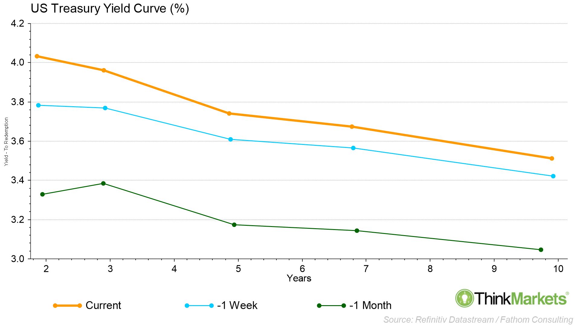
Quite simply, this chart is not supposed to happen.
As in, we really shouldn’t ever see such massive changes in such a short space of time. What we’re looking at here is the spread of yields between short- and longer-term interest rates in the USA as proxied by the yields on US Government Treasury Notes (“T-Notes”) from 2-years to 10-years out.
Usually, investors demand a higher rate of return on longer-term investments. Simply, time is money, and investors must be compensated for locking up their money in a T-Note for a longer term. But, because of the current rapid rate hike environment, markets have been caught off guard. Shorter-term rates are higher than longer-term rates.
This is because the Fed’s recent bout of tightening is forcing up short-term rates in response, but at the same time, investors are betting such aggressive policy will break the economy causing lower rates down the track. Therefore, the rates of return investors are demanding on longer-term T-Notes is relatively lower than for shorter-term T-Notes.
The above chart shows that over the course of the last month (as stocks have crumbled in response), the “yield curve” as it is called, has risen dramatically. It has also become more steeply “inverted”. Inverted just means not shaped like a regular yield curve which is usually bottom left-top right and consistent with the time value of money theory.
Inverted yield curves predict tougher economic times ahead, and indeed when they have occurred in the past, they’ve predicted a recession 100% of the time. A solid strike-rate!
Usually, where rates are supposed to be now and into the future is reasonably well flagged by the financial markets ecosystem, i.e., there’s usually a high degree of prediction certainty around such an important cog of the financial markets machine.
But today, certainty is out the window.
The yield curve rising this quickly and inverting so steeply at the same time is likely to break something, soon.
This is why investors are so jittery at the moment, and therefore why stocks MUST struggle!
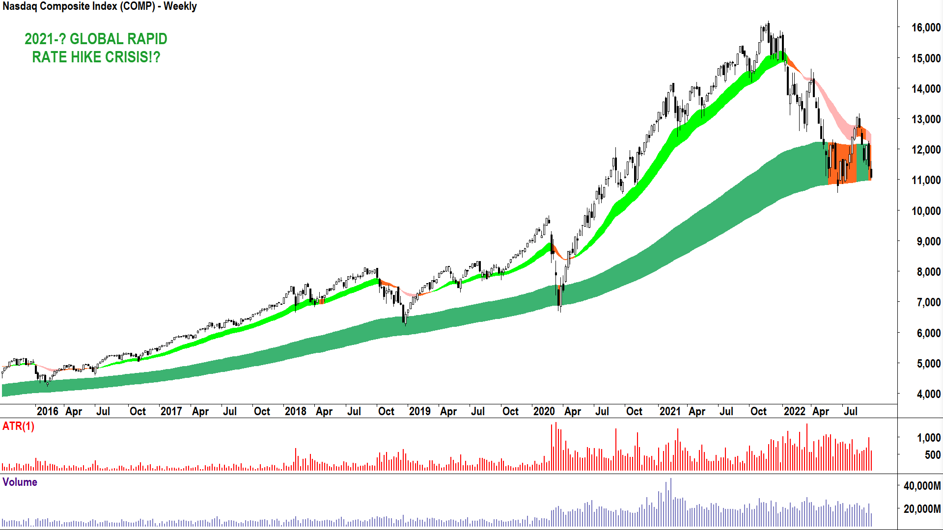
So, investors are nervous. OK, I get that. But stock prices have already come down a long way, and surely the Fed must be close to finishing what it’s doing by now? Things can’t get much worse… surely?
Um, well, yes they can! And the current situation (above) looks uncannily like a snippet of the chart from the GFC (below). Things can get far worse indeed.
So, should investors expect a repeat of what happened next in 2008 from here?
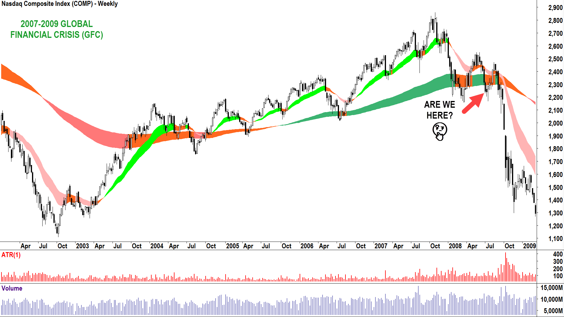
History doesn’t necessarily repeat, and we are not guaranteed to make the same mistakes of the past. But quite often, history sure does rhyme, and you don’t want to be “that investor” who goes down with the ship again/this time around.
So, my advice: Be aware of what can happen and take the necessary steps to protect yourself in the worst-case scenario.
Plan for the worse, hope for the best, as the saying goes!
This means understanding how to manage your portfolio risk, and more for some, how to profit from a falling market. In terms of managing your risk, understand in a bear market, pretty much everything is going to go down – blue chip or not. In fact, lose that term “blue chip” from your vocabulary. It’s caused too many investors to hold on to too much rubbish for too many years.
The simplest and most effective risk management tool is to go to cash. Cash is king, stocks crash, you buy back at a lower price and end up with more units of stock than when you sold. But, if stocks go up, you might have to buy back at a higher price. Boo-hoo for you, there’s no free lunch in the markets!
Many of my clients agonise over Option 1. “Carl, I can’t sell now because of capital gains tax”, or “I can’t sell because as soon as I do the market might go up.”
This is where Option 2 comes in.
Hedging involves betting against your portfolio in some way. Many like to sell call options. This strategy is good at giving you some protection against the downside whilst retaining some upside, but 90% useless when markets really tank. Buying puts provides better protection against the downside but is typically super expensive.
In my view, the simplest and most effective way to hedge is to sell CFDs against your portfolio’s holdings. Doing so can potentially neutralise your portfolio from further losses. This is also not without risks – the main one being the market goes back up and your portfolio is similarly neutralised against gains until you exit your hedge.
But, if the market does blow up, you can potentially achieve 100% downside protection for your portfolio.
The final piece of the puzzle is shorting. It’s a fancy way for describing an investment which profits when the price of an asset goes down. Again, CFDs are the easiest and simplest way for the average investor to participate in shorting. The process is simple. Choose a stock, choose a quantity (same as you do when buying a stock), and hit the sell button first.
Think of shorting as selling something at a particular price and having to buy it back sometime in the future. Obviously the lower you can buy it back, the better off you’ll be. Similarly, if the price increases, you’ll have to pay more to get it back. The bottom line is, you’ll be cheering the Fed to go another 100 basis points in no time!
With this in mind, I list below for your sheer charting pleasure four possible short trade opportunities.
Each stock can be shorted with a CFD.

Puns about the Blackmore’s chart needing vitamins and supplements aside, it’s certainly looking a bit peaky. You know my deal. The trend is your friend, and the trends here are long-term downtrend, short term downtrend (dark-pink and light-pink trend ribbons).
After identifying the trends, the Next stop for me is the price action, so this means checking the relationship between peaks and troughs, and of course my trusty candlesticks!
Lower peaks equals building supply – why? Well, owners of Blackmores see better reward to risk elsewhere. Lower troughs equals diminishing demand – why? Well, owners of cash see better reward to risk elsewhere. Think about these two facts for a second. Both buyers and sellers of Blackmores are telling you through its chart they see better opportunities elsewhere.
Add in frequent black candles, it indicates motivated supply and a demand-side reluctant to get in the way. Really, it’s just the 19 May 2021 low of $63.17 holding this one up.
My tip is this level will crack, and therefore substantially lower prices are in store for Blackmores.
View: Short trades until a close above the 13 Sep peak of $72.94.
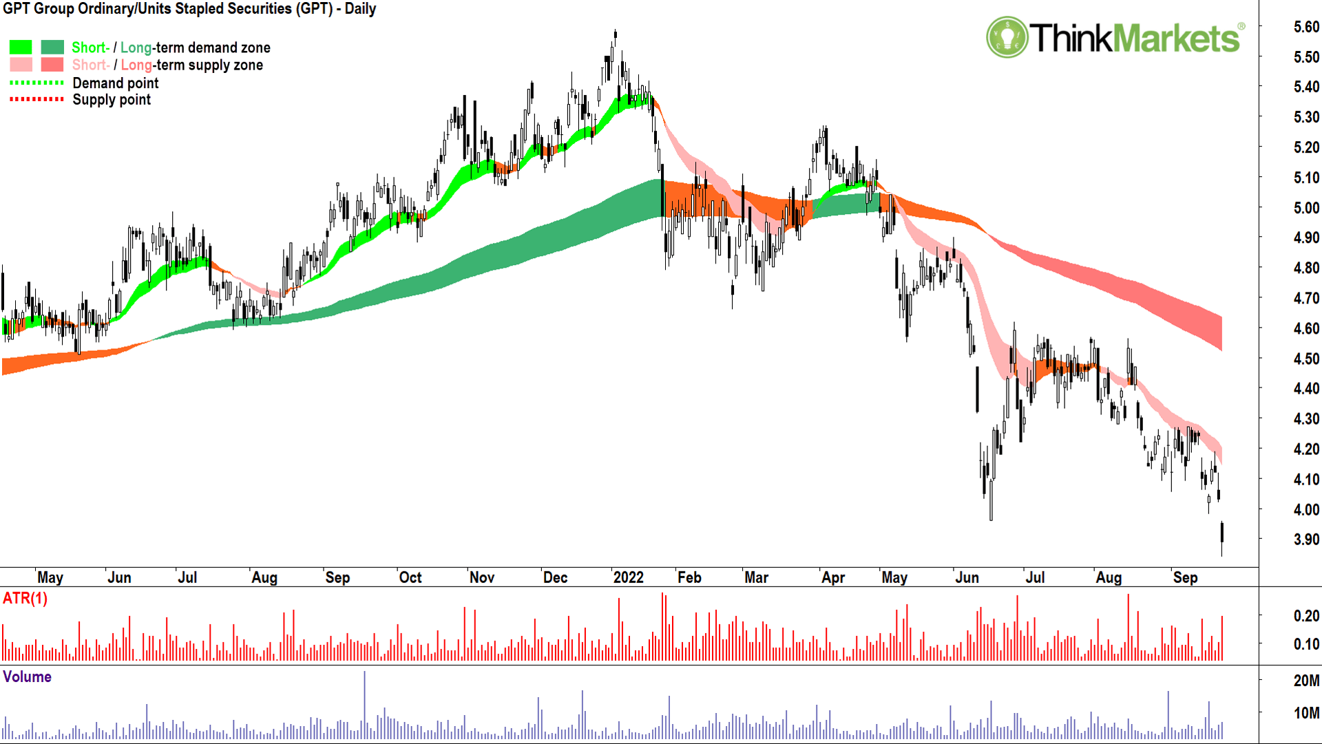
I wanted to include a property trust in this list because as a sector, they are in my opinion the clear-worst looking group of charts on the ASX. It makes sense too. Typically, property trusts have high debt levels – which is bad in a rapidly rising interest rate environment, and their assets tend to lose value in cyclical downturns.
It’s no coincidence then that the chart of GPT (and its friends in the broader property sector) have been trending lower for some time now.
My trend ribbon system is pretty simple and simple generally works best.
Double-green means buy and hold.
Orange means adopt a cautious approach (buys are off the table and it’s probably sensible to trim some of your holdings).
Double pinks means you should go to cash, start hedging, or add some shorts to your portfolio.
Hypothetically speaking, if you shorted 1,000 shares of GPT at $5 and bought them back at $4 you would have made $1,000, less costs. This is the maths of an investor who understands markets don’t always go up, and that when they go down, there’s always plenty of opportunity to earn profits by going short.
Ditto for Blackmores/GPT in terms of price action and candles, and worse still, today it cracked below the 17 Jun support point at $3.96.
View: Short trades until a close above the 8 Sep peak of $4.27.
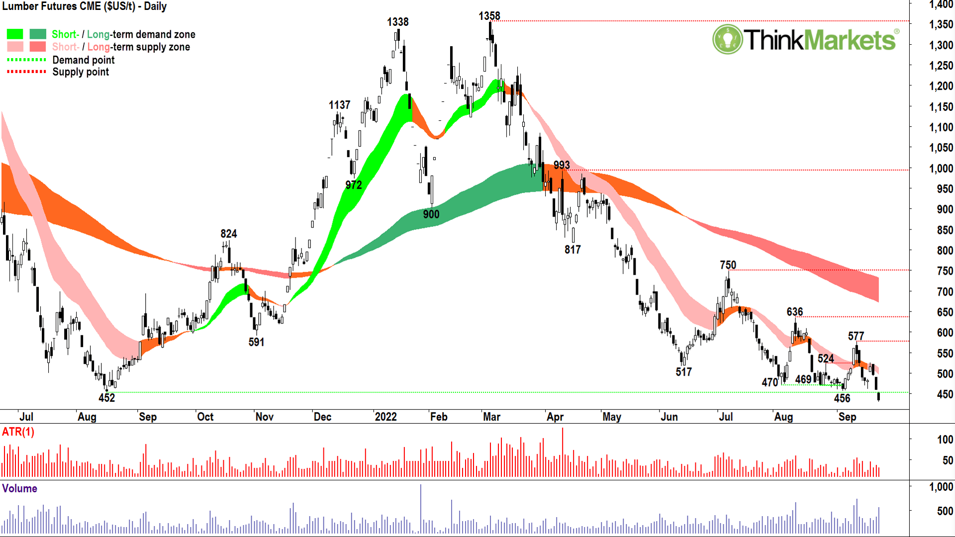
The CME Lumber contract shown above is a particularly good indicator of the health of the US housing market – a major contributor to US GDP. The combination of higher mortgage rates and spiralling construction costs have put the brakes on US home building, and industry metrics and home builder confidence have fallen off a cliff.
Talking about falling off a cliff, the price of lumber appears to be about to… Timmmbeeerrrrrr….!
Both the short- and long-term trends are well-entrenched to the downside and only the 17 August 2021 low of US$452 per-thousand-board-feet offers any potential support above the next major swing low of US$251 per-thousand-board-feet.
View: Bearish until a close above US$636 per-thousand-board-feet.

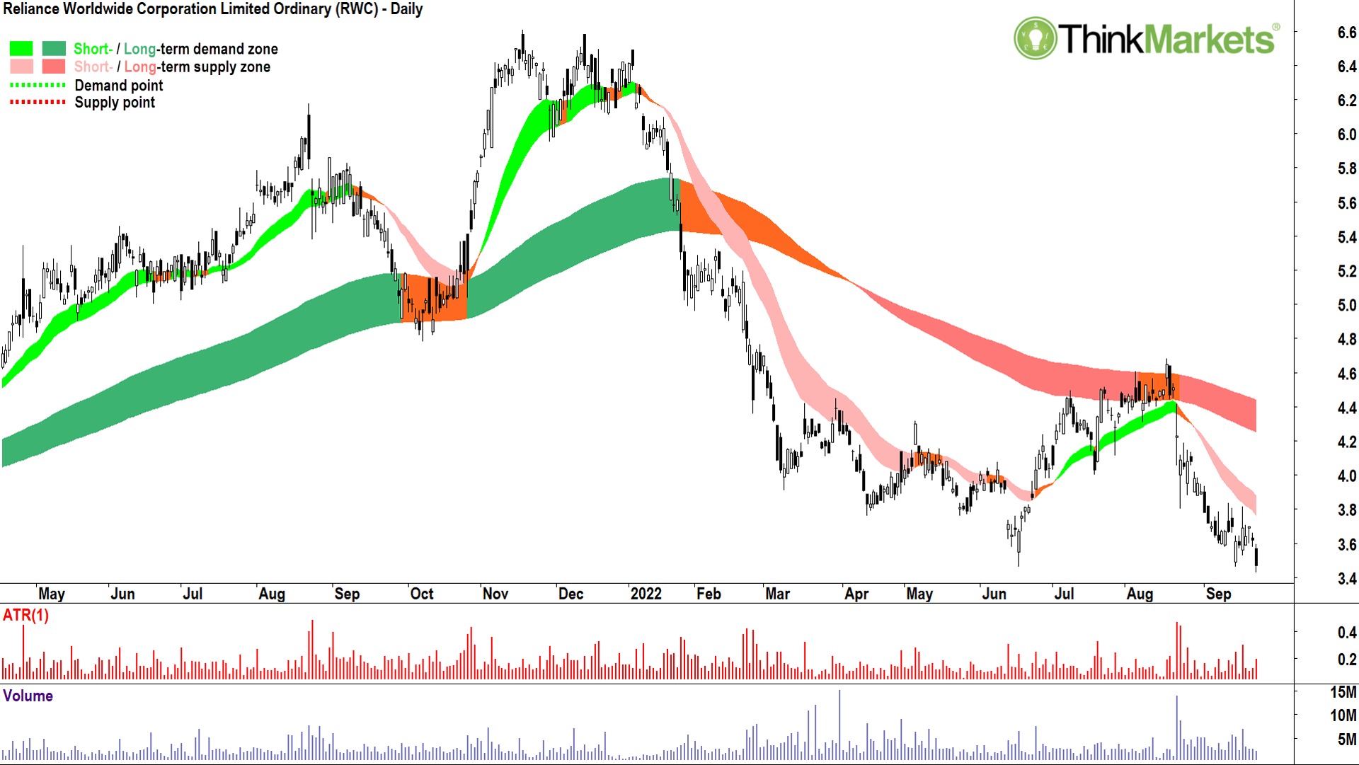
Segueing from the Lumber chart to James Hardie Industries and Reliance Worldwide Corp, below, makes plenty of sense. Both stocks are heavily dependent on the US housing market, in particular the discretionary renovations and improvements segment for earnings growth.
It should therefore be no surprise that the chart of James Hardie is in a clearly defined short- and long-term downtrend as evidenced by my long-term trend ribbon (dark-pink) and short-term trend ribbon (light-pink). If anything, that short term trend looks like it’s starting to accelerate.
I expect the first stop here is swing low set on 17 Jun at $28.59. Beneath that, there’s very little holding this one up until $20.
View: Short trades until a close above the 13 Sep peak of $35.60
Yes, this and the last three charts look very similar. They also look similar to the vast majority of stocks in the ASX200! There is a consistency, a familiarity to charts in a bear market. Oops, I used the (other) ‘B’ word…
Look, we’re not officially in a bear market yet, that won’t occur until we’ve declined 20% from our all-time high of 7633 set on 13 Aug 2021. The maths suggests 6106 is therefore the key imaginary inflection point between bull and bear (we’re around 6574 at the time of writing).
What I can say, is I haven’t seen this amount of bearish consistency in charts across so many stocks in the index since 2008. I’ve been around much longer than I care to admit, and in my time, I’ve seen many rampaging bulls turn into grizzling bears. It’s starting to feel a great deal like one of those times…
The Reliance Worldwide Corp chart looks sicker than most.
The short- and long-term trend ribbons (dark-pink and light-pink zones respectively) are well established to the downside. Rallies are feeble and fleeting. Selloffs are frequent and sharp. It does not bode well for the plumbing products supplier.
My tip is, below the 17 June low of $3.46, the Reliance Worldwide Corp chart going to bust a major leak!
View: Short trades until a close above the 19 Sep peak of $3.84.
Candlestick out!

Mining

Mining

Mining


Get the latest Stockhead news delivered free to your inbox.