The Candlestick: Dow Jones has nowhere to hide if the market’s Great Defensive Gambit fails in ’23
Experts
Experts
Carl Capolingua is the only Australian technical analyst you will meet in this story.
He works by candlelight at ThinkMarkets and lives with the little candelabrums in the western state that does what it wants, where they admire his unique brand of price action-based naked trend tracking.
Capo has been honing this art over some 30 years of investing, advising, and managing funds.
Every week in The Candlestick, Capo muscles into the unknowable iterations of markets – global, local and then rips into the very stocks that drive them.
Here he is sans photoshop:

Morning all.
This week, I’ve been pouring over the candlesticks from 2022. I’ve seen a few years of candles come and go now, but it’s still important to perform some periodic quality control. As a disciple of the black and white boxes with their all-important protruding lines, I must be able to periodically convince myself they still work.
Can I confirm the methodology created by legendary rice merchant Munehisa Honma in 1700’s Japan has held true for another year?
Before I answer that question, let’s firstly put 2022 into context. If it sucked for your portfolio, be it shares, bonds, or crypto, you’re not alone and I’m not to surprised.
This is because 2022 was an absolute outlier year for markets in many respects.
It was the first year both stocks and bonds suffered double digit losses.
And goodness me… it’s incredibly damn rare bonds and stocks go down in any year… but the losses seen across the two most important asset classes in 2022 was unprecedented in italics.
Never. Happened. Before.
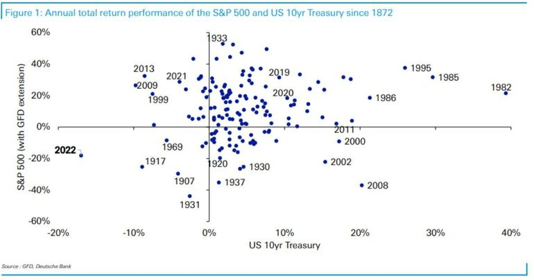
The above scatter plot is courtesy of the big German brains at Deutsche Bank.
It demonstrates just how far from the norm 2022 was.
Basically, bottom-left is bad for investors (both stocks and bonds fell in a particular year), and top-right is good (both stocks and bonds rose).
Note just how few dots there are in the bottom-left quadrant. This is because versions of the norm include both the major asset classes going up, or one going up at the expense of the other. So, 2022 was super nasty and super rare!
Perhaps the unprecedentedness (yes that’s a word, right-click it and select “brain ache”) of 2022’s market machinations can be explained by a combination of similarly unprecedented anvils dropped on the similarly unprepared heads of investors everywhere, all year: the ongoing effects of a pandemic, a major military conflict, a US Federal Reserve hell-bent on vanquishing inflation…
That last point, for me, was the main cause of all that unprecedentedness in 2022!
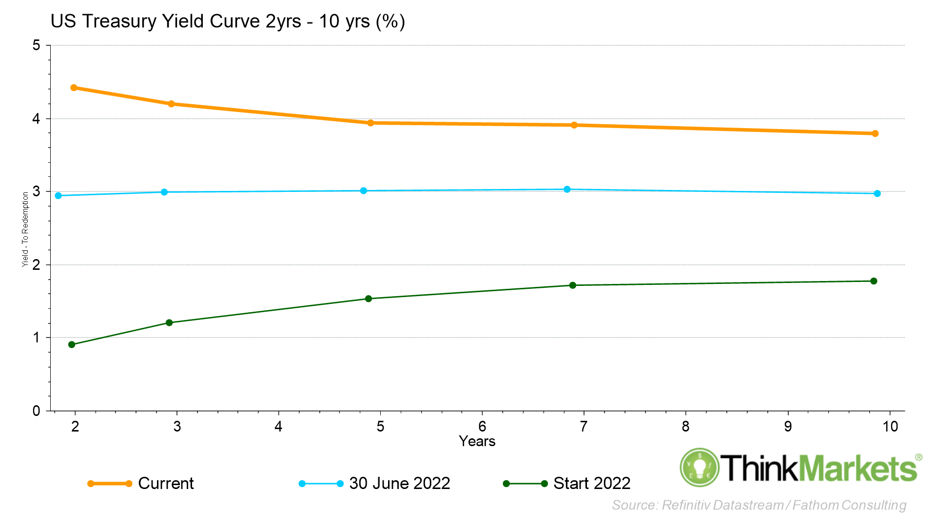
I know we’ve discussed this before, but a super quick reminder here: normal yield curves should look like the green line, consistently upwardly sloping.
It means the price of money gets progressively more expensive the further out in time you get. Financial markets tend to function in a very normal way when the yield curve is the green line (think: not bottom-left quadrant!).
Shortly alter the green mile, the US Fed embarked on its rampage against inflation.
It began hiking rates, 50 basis points, then 75 basis points at a time. Markets had been lulled into a false sense of Fed-security after more than a generation of central bank somnambulism.
But this Fed currently walking the green mile is a very different animal.
Unlike its predecessors, it appears very awake and very comfortable inflicting some short-term pain on Wall St to achieve the long-term economic gain which accompanies lower inflicting.
The result is short-term rates are forced rapidly higher.
Longer-term rates go up too, but by less because the expectation is rates will eventually moderate or come down later down the track as the economy slows in response to higher short-term rates. By mid-year, i.e., the blue line, the yield curve had flattened out, and by the end of 2022 it had inverted.
Yield curve inversion is another super-rare phenomenon in markets which has an unnervingly accurate record of predicting subsequent recessions.
And that brings us to the start of 2023. Current market settings remain very much jammed at “Abnormal”.
I’m not a prognosticator, I’m a trend follower. In other words, I don’t assume I’m smart enough to predict the future, so I choose to react to the past. Therefore, I won’t tell you things are going to get better or worse in 2023, I don’t know, I can’t know.
I will say however, in my experience (call it a sixth sense based upon how markets “feel” right now), I expect we’re going to see some super interesting markets in 2023. You will need to be on your toes. You will need to know how to read a chart. You will need to know how to read the candlesticks… which, yes, I can confirm after my review of 2022 very much still work!
Indeed, I believe that they work as well as ever. Thanks Munehisa you cunning son of an Osaka-based, Dōjima Rice Exchange trader during the Tokugawa Shogunate!
In the last iteration of Candlestick, we discussed the concept of the “Value versus Growth” trade.
Out of all of 2022’s unprecedentedness, this was for me the most important trade you needed to understand. I expect it will continue to feature in 2023.
I’ll let you review that last Candlestick for an in-depth discussion of risk-on vs risk-off and of Value vs Growth.
In summary, I left you in November with this advice: Trust Growth! This brings us to the COMP, the world’s premier growth index.
Growth suffers the most when interest rates skyrocket, and the COMP logged a 33% decline in 2022, its worst year since the GFC.
I believe unless the COMP makes a meaningful turn around, there will be no enduring bull market in stocks, anywhere.
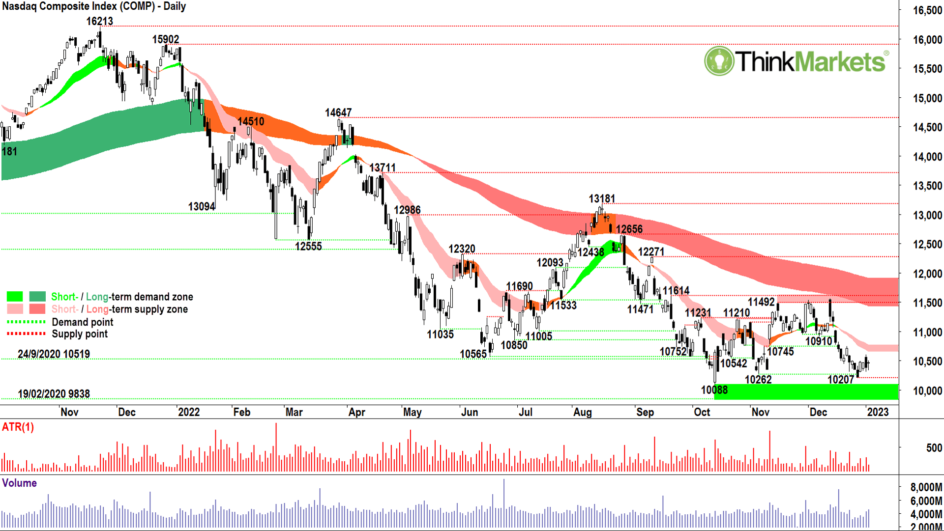
Unfortunately, as I look at the candlesticks, the price action, and the trends, there’s little to suggest a meaningful turnaround in the COMP is imminent.
The long-term trend ribbon (dark pink zone) remains entrenched to the downside – where it spent the majority of 2022.
I was no genius by remaining bearish on US-tech throughout last year, I simply followed the trend. Rarely have I seen such a reliably enforced long-term downtrend in a major stock market index.
To end its bear market, the COMP must close above, and then hold above the long-term ribbon. This implies a move back to at least 11,500, but more likely to 12,000. In percentage terms, it means I’d be happy to give up close to 15% from current levels before I could apply any capital to stocks in the COMP with confidence.
The short-term trend ribbon (light pink zone) is also set to the downside, and it will likely impede upside price momentum around 10,650-10,750. The price ac9on since the 13 December peak has been very weak, lower peaks and troughs, and the rallies appear feeble compared to the dips.
Also since the 13 December peak, frequent supply candles (black bodied and or upper shadows) demonstrate little motivated demand above 10,750. I can see some tentative demand trying to sniff out a potential low around 10,200 (a few white-bodied candles).
Most likely these are the same buyers from November’s 10,262 trough and October’s 10,088 big stand. It looks like they’re running out of faith…and, alas, money.
I’ll be watching for further supply candles around the short term trend ribbon which could pave another attack on the remaining demand in the 10,088-10,262 zone. If that zone fails, then the COMP bear market is going to plumb new depths in 2023.
View: Bearish unless a close above 11,614, possibly back to neutral there, but couldn’t contemplate a bullish bias until a close above the long-term trend ribbon.

The other half of the Value versus Growth trade is the DJIA
So, how is the world’s premier value index tracking? Well, it’s still better than the COMP, but some of the gloss from it’s incredible October run has worn off. The value trade, the great defensive gambit of 2022, is beginning to falter. If it goes, then things are going to get ugly for stocks in 2023.
It will mean there literally won’t be anywhere to hide.
All is not lost though!
You know my traffic light system and you know my trend ribbons act as dynamic support. So, long and short-term ribbons are presently orange, which means caution, not panic. Also, the long-term trend ribbon is offering some s9ff support against a continuation of the 13 December plunge – at least it is for now!
The price action since that plunge is far from a picture of strength, though. If anything, the congestion between the two trend ribbons indicates the enthusiasm shown for owning value stocks in October is evolving into concerned doubt. A close below the 22 December trough low of 32,573 will likely precipitate a decline to at least the 3 November low of 31,727. On the other hand, a close above the 21 December peak high of 33,438 could see a recovery to the 13 December high of 34,713.
The candles confirm there is a solid base of demand fishing around the long-term trend ribbon, in particular I note healthy white bodies on the 21, 23, and 29 December candles, and lower shadows on candles on 22, 30 December and 3 January. My tip, don’t count the value trade out just yet.
View: Neutral until a close above 33,438, getting more bullish there, but prefer a close above 34,713 to get really bullish. Lights out on a close below 32,573.
S&P ASX200
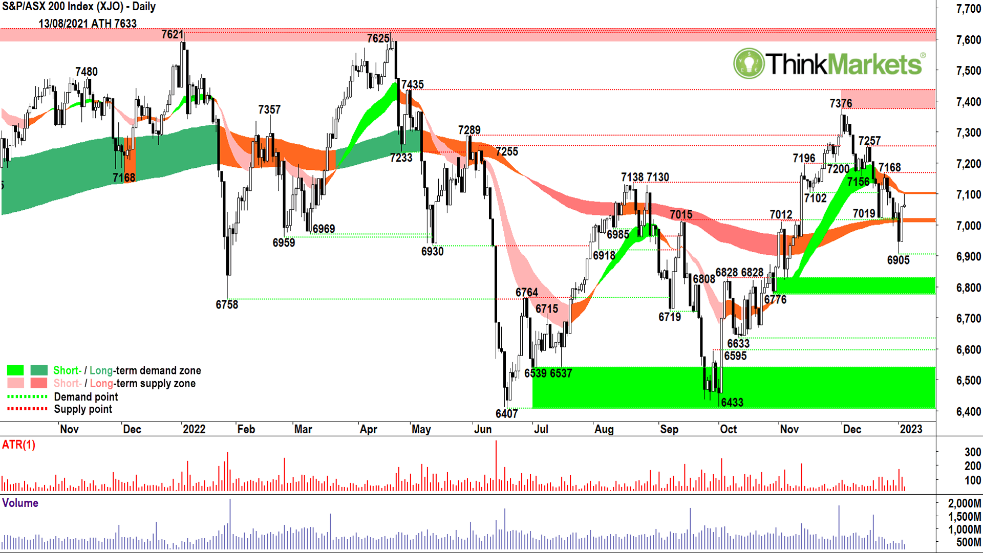
In my last update, I noted the XJO was demonstrating more value than growth characteristics.
Our major banks and resources companies were effectively bench-pressing the entire local bourse. Like the DJIA, some of the air has escaped the XJO’s balloon and it’s now both under pressure and at a key technical crossroad.
Double orange on the short -and long-term trend ribbons, same as the DJIA, but the XJO gave the long-term ribbon a major 9ckle on 3 January. The rebound on 4 January was partly impressive, partly baffling, and the two-candle demand pattern it creates is far from common. Similar to the DJIA, my gut says you can’t completely write of the XJO, but at the same time there are substantial risks building.
The price ac9on remains clear lower peaks and lower troughs, indicating confident supply and demand which is prepared to wait for lower prices before committing. This needs to switch back to higher peaks and higher troughs to confirm 6,905 as a meaningful low which could then facilitate a move back to the 1 December peak high of 7,376.
A close above the 22 December peak high of 7,168 would be a key first step in this scenario.
Looking at the bear case, a close below 6,905 will see a push into what should be a very reliable zone of demand between 6,776 and 6,828. There’s potential for demand to support prices at 6,595-6,633 and then at the ‘big one’ at 6,433-6,539. The catalyst for any of these demand zones to come into contention would be a batch of supply side candles between the short-term trend ribbon at 7,105 and 7,168. If you see them, 2023 is going to get worse for the XJO before it gets any better.
View: Neutral until a close above 7,168, getting more bullish there, but prefer a close above 7,376 to get really bullish. 7,100 could be a key supply pressure point, supply candles there will kick-start a move to lower demand zones.
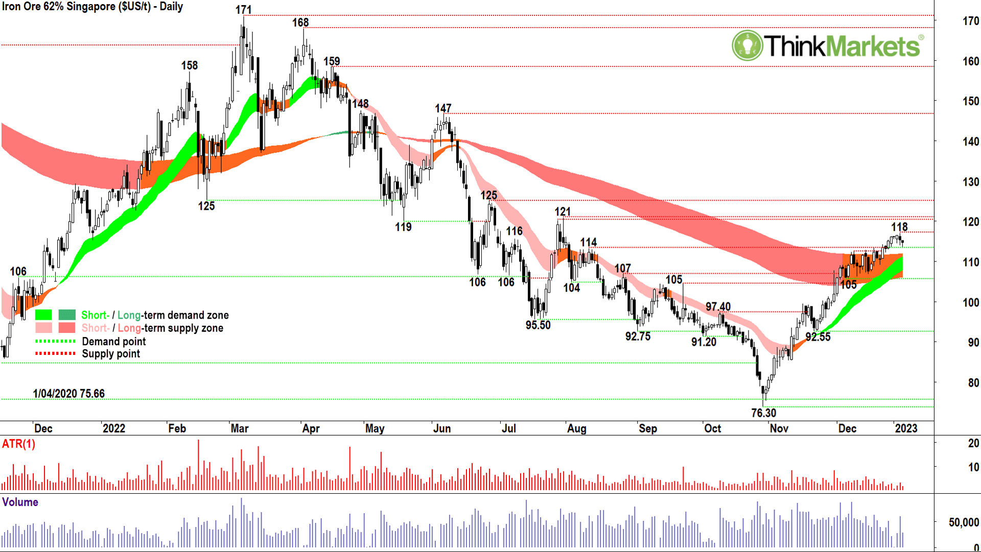
A major contributor to the XJO’s invincibility through October and November were the massive gains in index-heavyweights BHP (ASX:BHP) +27%, Rio Tinto (ASX:RIO) +33%, and Fortescue Metals Group (ASX:FMG) +45%. We all know the common theme here is iron ore, and it’s similar about face reversal from 30 October’s trough low of $76.30 to 3 January’s peak of $118 – a massive +50% gain of its own.
If you saw that one coming, you either knew about the next chart, or Nostradamus, you knew a slew of beneficial extenuating circumstances were about to ride to the rescue.
You can Google them, but in a nutshell, they were: rumours of an easing of China’s harsh COVID-zero policy, Beijing throwing US$200-odd billion at China’s zombie property sector, and then the actual easing of the aforementioned COVID policy. It doesn’t matter, iron ore got a rocket under it…and despite sentiment towards China’s fledgling reopening swinging decidedly bearish over the last few weeks – enough to derail global equities again – iron ore hasn’t flinched.
You know I’m a sucker for relative strength (i.e., strength in the face of everything else going down), and iron ore has it. So, based upon this, an unwavering rise in the short-term trend ribbon, and a successful breach of the long-term trend ribbon, I’d suggest stronger for longer for the iron ore price. If I’m correct, it suggests there will also be plenty of corresponding support for the charts of BHP et- al.
But! Ha! There’s always a but! Note that November-December is typically the strongest period of the year for iron ore anyway. This is because of a seasonal pattern where Chinese steel producers restock their inventories of iron ore after the late-summer-spring draw down.
That drawdown occurs because they usually stock up during June-July ahead of peak summer steel production.
Inventories need to be restocked by January-February because of the Chinese Luna New Year holidays which typically occur at the end/beginning of those months respectively. The period through March to May is, therefore, you guessed it, another drawdown. So, it is possible we are approaching a seasonal high in iron ore which could see around 5-6% knocked off the price.
Seasonal patterns are common in many stock and commodity markets. They are another important tool technical analysts use to time their trades. I don’t live or die by them, but I like to know what they are to help me shape the decisions I make using my trends, price action, and candlesticks.
View: Bullish until a close below 105.
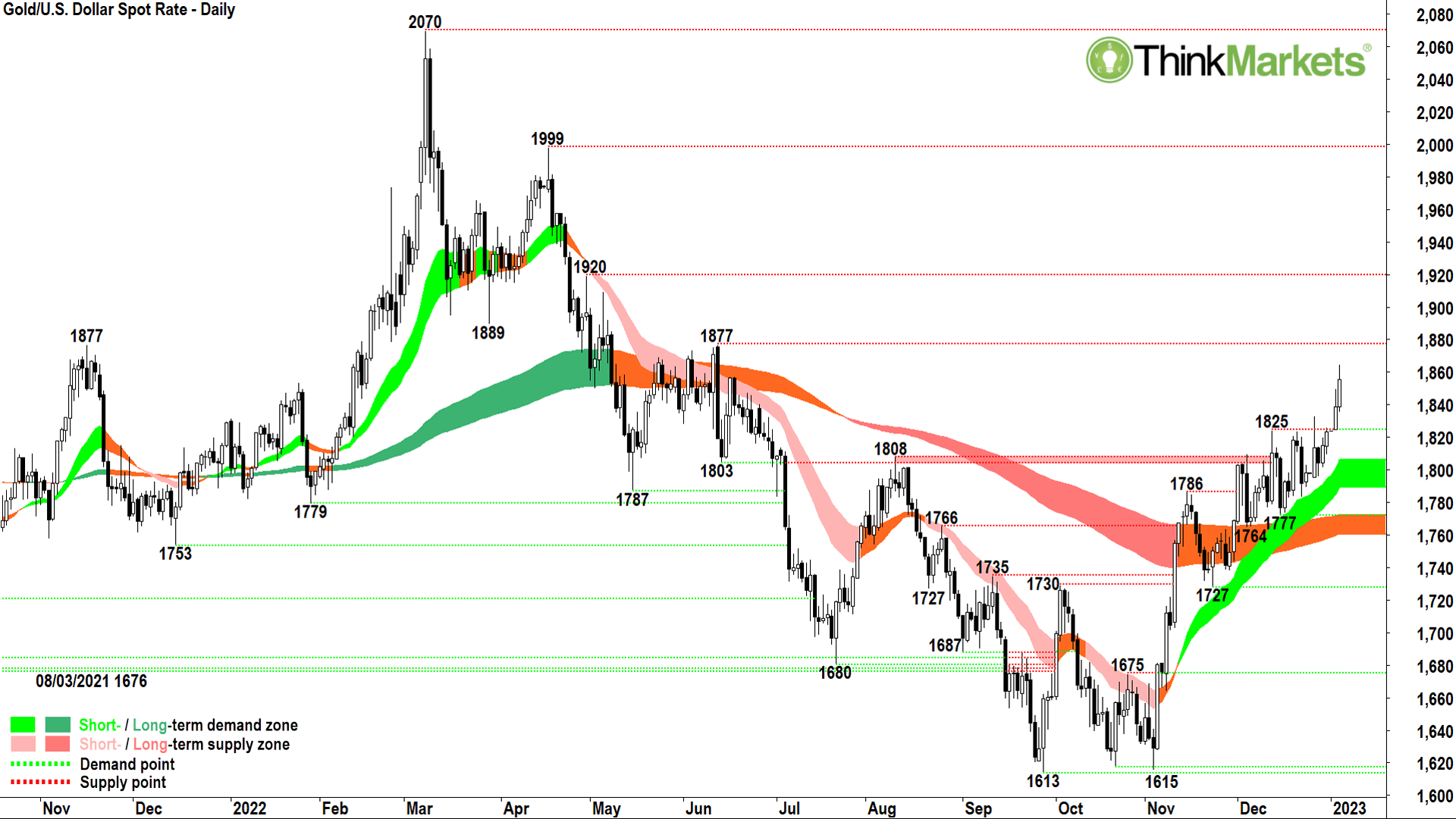
Gold has staged a similar reversal to iron ore in the back-quarter of 2022. It’s done the hard work at the long-term trend ribbon which now is behaving as a dynamic support zone. Big 9ck. The short-term trend ribbon is impeccable, the price ac9on appears to be freeing up after a period of light congestion through December, and I can see plenty of persistent demand in those candles. Tick, tick, tick.
Now, when the typical Aussie investor hears gold is going up, their default no9on is to rummage around the ASX for their favourite gold stocks. I’ve no issue with this strategy, and notng the improving technicals in the gold price I topped Capricorn Metals (ASX:CMM), Evolution Mining (ASX:EVN), Newcrest Mining (ASX:NCM), and Perseus Mining (ASX:PRU) in various media spots and in my weekly webinars in early December.
This week, I’m adding Northern Star Resources (ASX:NST) and Ramelius Resources (ASX:RMS) to my shortlist of favourite gold charts.
But! (there it is again) TBH, the simplest way to capitalise on a rising gold price is to go straight to the source and buy a futures contract or CFD on gold itself. This cuts out any possibility the gold stock you own blows up because of a production mishap, or because of the vagaries of fund managers’ reluctance to come to the gold party.
Trading in any leveraged product can be risky, so you know the drill, do your own research on trading gold directly.
View: Bullish until a close below 1,777.

WTI crude oil was a notable absentee from the China reopening party which boosted the prices of several commodites. On the one hand, this is concerning because it suggests a weaker global growth outlook as a result of the reopening, but it’s potentially also helpful for stocks (well, not energy stocks) because it helps cool inflation.
The chart suggests further weakness may be in store for WTI as the long-term trend ribbon has officially swung to down. Whilst my traffic light system is obvious: green equals up, orange equals caution, and dark pink equals down, we can derive huge amounts of information from our other key technical tools price ac9on and candlesticks to tell well in advance a long-term trend change is coming.
Particularly note around June 2022 how the price ac9on swung from higher peaks and higher troughs to lower peaks and lower troughs.
Note also the increasing prevalence of supply side candles, and the clear reversal in the short-term trend ribbon as it went from offering dynamic support to dynamic resistance. Finally, around July through August, instead of the long-term trend ribbon (now transitioned to orange) offering dynamic support, it too began to offer dynamic resistance.
Keep an eye out for this process of long-term trend change as it really is just a check-box system.
The major supply candles of 3 and 4 January are the most decisive elements of the WTI chart. They are a clear and damning reinforcement of the excess supply which remains in the system here. I have to assume the long-term downtrend will prevail un9l WTI can close back above the 81.50 high of 3 January, and therefore signal the motivated supply which exists there is gone.
Extrapolate the weakness here out to the charts of Woodside Energy (ASX:WDS), Karoon Energy (ASX:KAR), Santos (ASX:STO), and Beach Energy (ASX:BPT) which are all flashing warnings over changing their own long- term trends for the worse.
I prefer to lighten WDS, KAR, and BPT, while STO is closer to an outright sell.
View: Bearish until a close above 81.50, getting more bullish there, but prefer a close above 93.74 to get really bullish.

Let’s close this Candlestick out with a quick review of Dr. Copper’s progress. Copper has been referred to thusly because of its ubiquitous use across so many industries. Basically, investors have long used the price trend of copper to diagnose the health or lack thereof of the global economy.
Copper trended lower for most of 2022 as the global growth outlook crumbed in the face of those relentless US Federal Reserve rate hikes. Ongoing supply issues helped it steady mid-year, and like iron ore, it was a beneficiary of the China reopening and property sector bailout developments.
So, all of the above leaves the Doc stuck in the middle at the moment. By all accounts, global growth is most likely going to be in the toilet in 2023, yet supply remains very tight at both London and Shanghai Metals Exchange warehouses, and the long-term demand story from the EV revolution continues to excite investors looking for the next big investment theme.
If I had a dollar for each 9me I’ve heard copper labelled as the “Next lithium” over the last few months, well I’d have at least 20 bucks – enough to buy four or five pounds of copper. Not that I would, however. The chart just doesn’t support it – not un9l a close above the 14 November peak high of 3.96 that is.
Looking at the number of peaks and supply candles punctuating the zone between 3.93 and 3.96, it’s clearly the key make or break level. Clearing 3.96 would also provide the added bonus of successfully dealing with that pesky long-term trend ribbon, which despite transitioning to orange, has continued to impede upwards price movement.
The bear case appears on a close below the 20 December trough low of 3.72. This would likely see a steeper decline to test demand at 3.54-3.56. Below there and the Doc is looking very sick indeed – it will be back to long-term downtrend stuff.
I know ASX-listed copper producers are high on investors’ shopping list lately (next lithium believer, huh?). But again, I suggest the best way to play the impending boom in copper prices is by buying the commodity itself. Mining companies are temperamental things, and many a boom in a particular commodity has occurred with less than coincident performances in companies trying to find or produce that commodity for a profit.
View: Neutral until a close above 3.96, bullish there, but bearish on a close below 3.72.
The views, information, or opinions expressed in the interviews in this article are solely those of the interviewees and do not represent the views of Stockhead. Stockhead does not provide, endorse or otherwise assume responsibility for any financial product advice contained in this article.