
I don't want to hear it - we're on a tight budget and you get the gist. Via Getty
The Candlestick: How a Bull turns into a Bear in nine charts
Experts
I don't want to hear it - we're on a tight budget and you get the gist. Via Getty
Experts
Carl Capolingua is one of Australia’s leading technical analysts. Admired for his unique style – reminiscent of the early days of Pink Floyd, before Syd Barrett went scooby-doo – of price action-based trend tracking.
Capo has been honing his art over some 30 years of investing, advising, and managing funds.
Every week in The Candlestick, Carl will be plotting, for your sheer madness, a data-trove of unlevened technical analysis covering markets globally, then drilling down into it remorselessly-fearlessly and stock-specifically.
Here is his picture. (Sometimes it’s good to put a face to this sort of work, esp. when both the face and the work are so fair-to-middling.)

Last week we discussed the idea of “dislocations”.
Certainly, I did. You contributed very little.
Dis-lo-ca-tion.
Any way you come at it, the word reeks of pain.
Now it could be a wee Bondi Rescue “Here have a puff of the green whistle for the camera while I pop that shoulder back in” kind of dislocation… Or – when it comes to markets – it could be a genuine “Dear lord how can there be so much pain in the world and this really shouldn’t be happening and heavens that’s not how it should look at last I understand fear” kind of dislocation.
It usually takes something big and unprecedented to cause a market dislocation.
In 1987 it was too much leverage and the advent of computer trading; in 2000 it was the promise of the internet; in 2007 it was the miracle of Chinese growth vs the collapse of the US housing bubble. This time it’s the COVID-19 pandemic.
It’s very rarely a case of simply popping that shoulder back in and jumping back on the surfboard, alas.
It usually takes years for markets to heal the damage caused by a major dislocation, and there are a few moving parts for investors to contend with this time. Inflation, constricted supply chains, rising interest rates, geopolitical tensions etc. – markets are trying to figure out how all the parts fit together.
One of the quirky (and disturbing) indicators for me this time around is the fact bonds and stocks have been falling at the same time.
This tells me just how nervous investors are right now, and just how big this dislocation is.
One saving grace is that we’re not yet seeing a liquidity crunch. That is, when sentiment swings from a lack of trust in economic growth and future company earnings, to a lack of trust in counterparty solvency, and potentially even in the ongoing functioning of the financial system itself.
This is when things get particularly nasty, and corrections turn to into crashes (i.e., the “Lehman Brothers Moment”).
The great thing about charts is that they simply reflect the balance or imbalance between demand and supply for a particular asset.
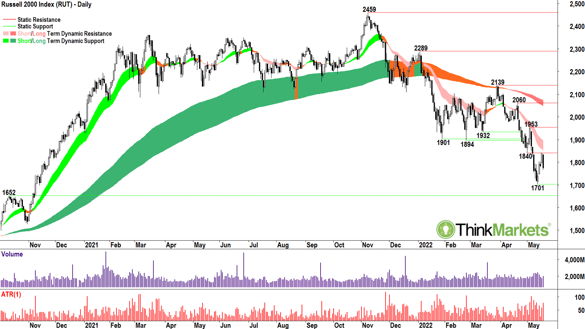
When we chart a whole market index, like the Russell 2000 Index, we’re getting an evolving picture of how demand and supply is changing over time for a whole group of stocks. As the name suggests with the Russell, 2,000 small capitalisation US stocks.
Bear markets, even crashes, have a habit of creeping up on you – unless you know how to read a chart!
The Russell 2000 is the perfect case in point. It’s the best picture I can find for how a bull turns into a bear.
My indicators (a combination of short- and long-term exponential moving averages) help me determine when the balance of demand and supply is skewed towards the bull case, the bear case, or neither case.
The shaded areas (or “ribbons”) represent the short- and long-term trends. I use a traffic light system. In a bull phase the ST/LT ribbons are light green/dark green, in a neutral phase both are orange, and in a bear phase they are light pink/dark pink.
From here it’s simple!
Green is the best environment for investing, orange would suggest not applying any further capital, and pink suggests you should consider lightening the load.
Short-term traders are probably better off monitoring the short-term ribbon, and long-term investors the long-term ribbon.
If you look at the Russell 2000 chart with these goggles on, investing doesn’t appear difficult at all.
Green-green until March 2021 when the short term uptrend flattened out.
By late 2021, the long-term trend was coming under increasing pressure (i.e., orange equals stop investing further capital), and by as early as February this year we were trading decisively below the long-term trend zone (i.e., start lightening the load).
In April, it’s official bear market stuff.
There’s a bunch of other herbs and spices in my technical analysis mix of course, and I will discuss many of them in the charts below. But for now, note the Russell 2000 is decisively in a bear market.
Worse, this smacks of major “risk-off” for markets more generally because it’s usually smaller stocks which tend to suffer sooner and greater in any economic downturn. The Russell 2000 was the canary in the mine shaft this time around, giving us some fantastic advance warning not all was right with the US bull market.
View: Bearish, sell rallies until a close above 4 May high of 1953.
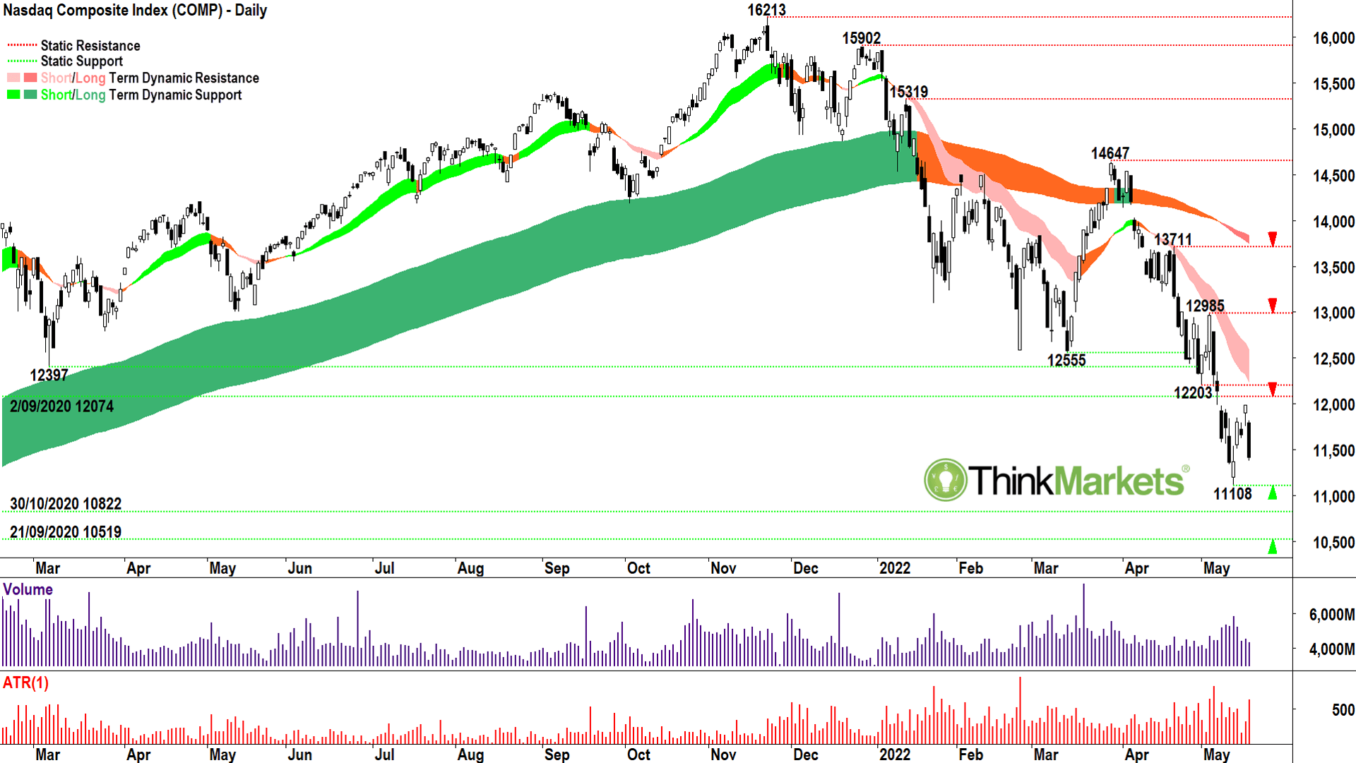
Just a quick catch up on the Nasdaq Composite because like the Russell 2000, I feel this is a crucial chart in understanding when markets are beginning to calm down, and therefore a meaningful rally might become a possibility. The Russell 2000 and the Nasdaq Composite represent the riskier end of the US equities spectrum.
This is the end of the spectrum which does the best in good times, does the worst in bad times, and in either case, tends to turn around before other less-risky markets.
I called the end of the Nasdaq bull market as early as January this year (SH: Yeah, it’s totally true there’s a bunch of various CNBC and other media appearance moments where Carl is literally talking to his future self. He won’t say but he likes when Future Carl can give Past Carl the thumbs up. Which is often.)
The March rally was a conundrum, but since it petered out, we’ve witnessed a steady array of lower peaks and lower troughs. Note also how often the last peak coincides with the second-from-last trough. This demonstrates how previous areas of excess demand (support), can act as future areas of excess supply (resistance).
The zone between 12074 and 12203 now represents an important potential excess supply point which much be consumed before one can even entertain ideas the Nasdaq bear market is over. I’d even wait until a close above 12985 before even considering that possibility. The trends are well entrenched to the downside and the candles are uninspiring.
View: Bearish, sell rallies until a close above 4 May high of 12985.
It’s all a bit depressing, huh? (SH: Yes Carl, now for some good news…)
Well, this one isn’t going to make you feel any better. (SH: Cad!)
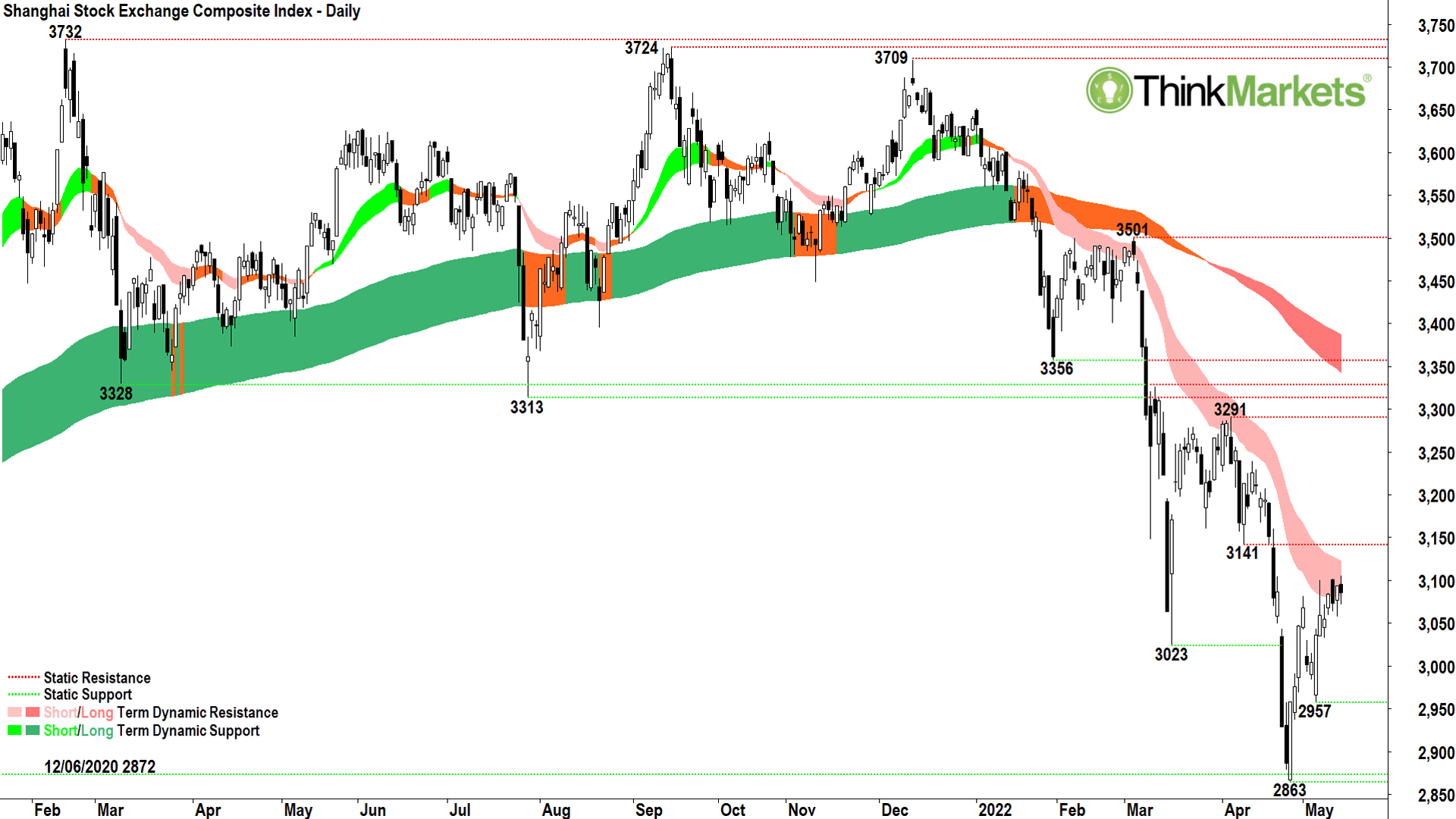
I’ve been impressed with the rally in Chinese stocks since the late-April low.
This type of relative strength compared to other global indices could indicate further stimulus is on the way from Beijing, the Chinese economy is on the mend despite the lockdowns, or simply state-backed enterprises are buying stocks to prevent a major market meltdown.
It could be all, some, or none of the above of course, but it does bring us to a very interesting juncture on the Shanghai Composite.
That light-pink ribbon concerns me. It’s been very reliable since the bear market began back in March in identifying points where a short-term uptrend reverses course and realigns with the broader long-term downtrend. So far, the candles aren’t terrible in this zone, as in, I’m not witnessing a great deal of excess supply. But if we do see a growing cluster of black candles here, or candles with upper shadows (wicks), it would indicate the supply-side is beginning to reassert its influence.
Another sharp drop back towards the lows at 2863 could be yet another catalyst for falls in other markets, particularly our own.
Still, there is a chance the Shanghai Composite bucks the trend and throws us a bunch of white candles in the ST ribbon, or just as good, candles with lower shadows. This would indicate growing investor confidence in the face of broader global risk aversion, and it could help swing the balance back to the bull case.
So, it’s simple from here – watch those candles!
View: Bearish, sell rallies until a close above 12 April low of 3141.
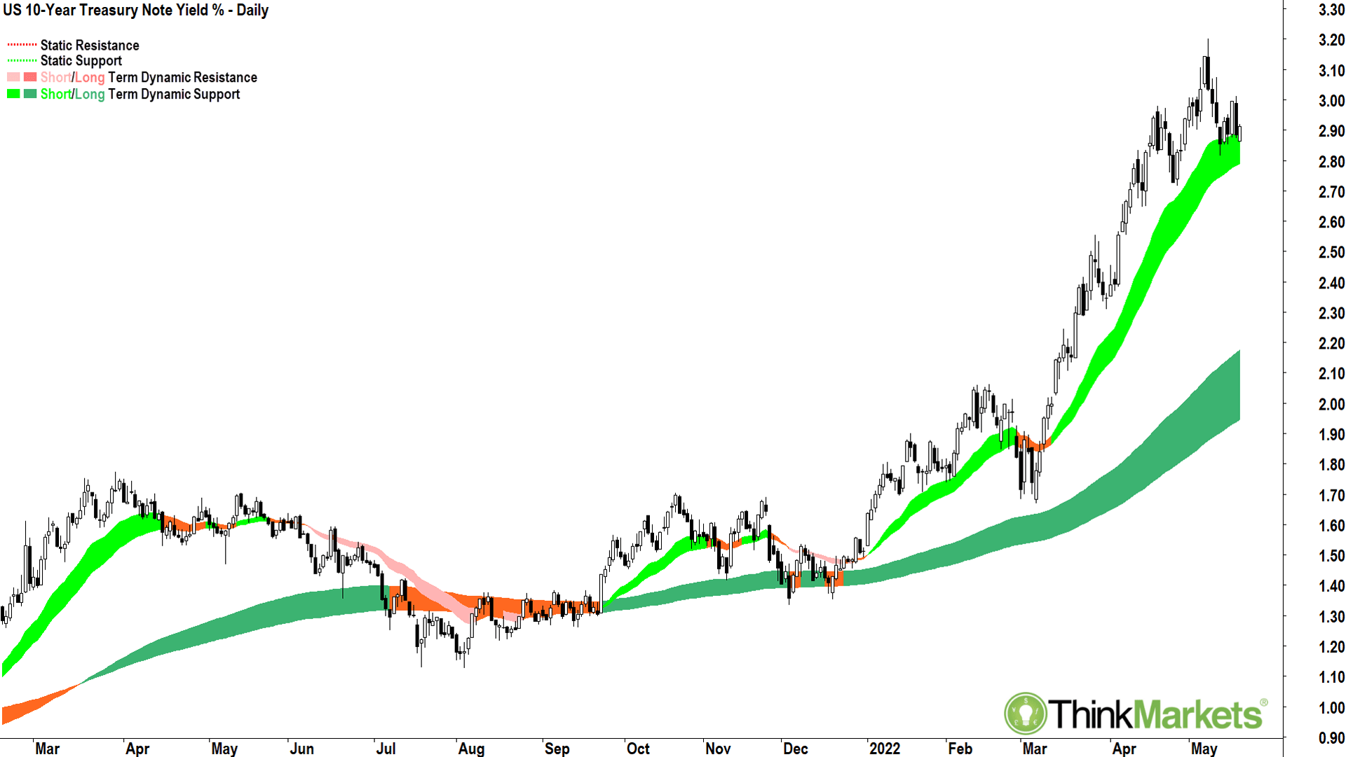
Just a quick note on this one because I don’t want to lose momentum in our discussion about yields vs stocks from last week!
I can see the very early signs of a topping formation here.
The 18 May candle forms a lower peak, a first chink in the armour of this amazing uptrend. The last two weeks have delivered more black candles and upper shadows than white candles and lower shadows. These are tentative indications yields could at least moderate from here.
This will help stocks by taking one of the key negatives off the table, but we just need to watch the rhetoric around why yields are moderating. Is it because the Fed is seeing inflation is coming under control without the economy falling off a cliff, and therefore it doesn’t have to be so aggressive raising interest rates?
Or is it because the economy is falling off a cliff, and therefore the Fed wouldn’t dare be so aggressive raising interest rates?
Each scenario will have very different consequences for stocks. It cuts both ways, eh Carl?
SH: Hmm sounds to me like it cuts both ways, eh Carl?
Enjoy this brain loosener then, from the inimitable Gloria Estefan. (From a simpler time when sitting on a chair and putting a fan on made great telly.)
Thank you Gloria.
Now let’s get Candle-stock specific.
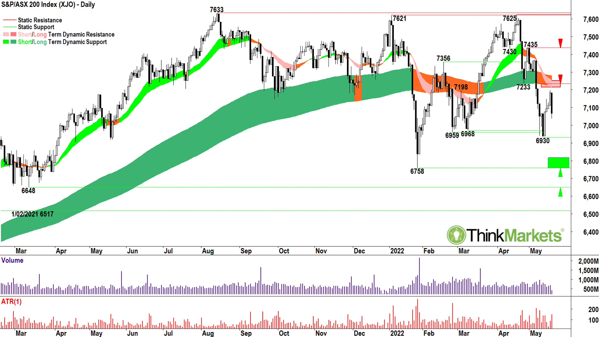
The Aussie market clearly has not suffered in the same way as US and Chinese markets.
Looking at the chart above, it would be hard to argue we’re still in a clear long-term uptrend though.
It’s neutral at best. And really, it’s been neutral for the better part of a year now.
But that’s the tricky thing about our market! Depending on which sectors you’ve been invested in, it easily could have felt like either a bull or a bear.
Technology, discretionary, healthcare, and gold – these sectors have each been in clear bear markets for some time. Yet energy, financials, materials, staples and utilities have fared so much better, and in the case of energy and utilities, remain in strong bull markets.
Net-net, we’re hanging on, but only just and if I put my really bearish hat on, I could argue a close below 6930 would start an official bear market in Aussie stocks.
Certainly, a close below 6758 would make it a lock.
Given the situation is so finely balanced, I’m going to hedge my bets by saying if we can close back above 7233, it would give me greater confidence the ascendancy is tipping back to the bulls. But this is make or break stuff!
View: Bearish, sell rallies until a close above 27 April low of 7233.
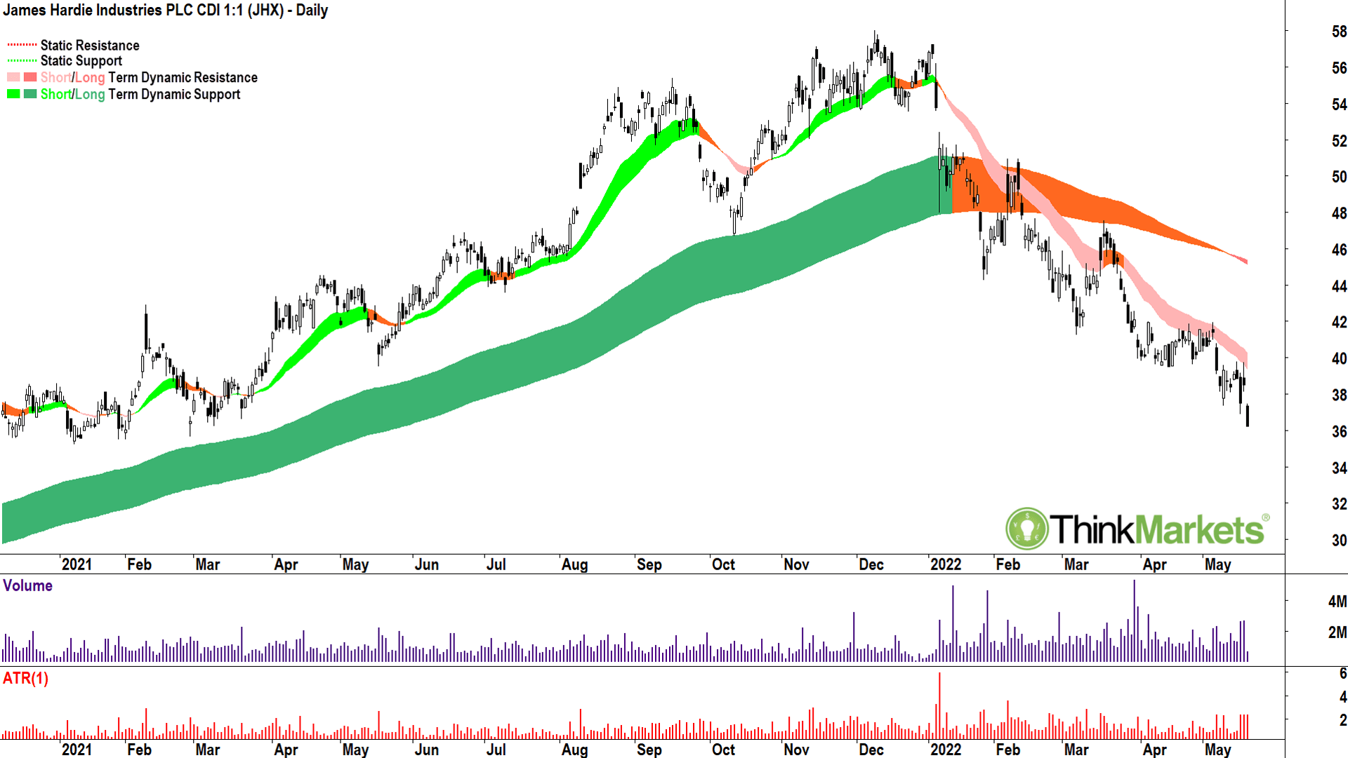
Looking at the major ASX stocks, James Hardie Industries (ASX:JHX) most resembles the major US stock indices. It has a significant exposure to the US economy, particularly the housing market, and it’s also dual listed on the New York Stock Exchange.
Note how well the short-term ribbon cushioned prices on the way up, and equally how it has snuffed out each promising rally on the way down. In this way, I say that the short-term ribbon provides “dynamic support” in a bull phase and “dynamic resistance” in a bear phase.
We can also see how the trend transitioned from up to down via the breakdown of the long-term ribbon. The failure to reclaim the long-term ribbon in mid-February was the death-knell.
James Hardie’s chart is almost the perfect example of a downtrend… so look out below.
View: Bearish, sell rallies until a close above 5 May high of $41.98.
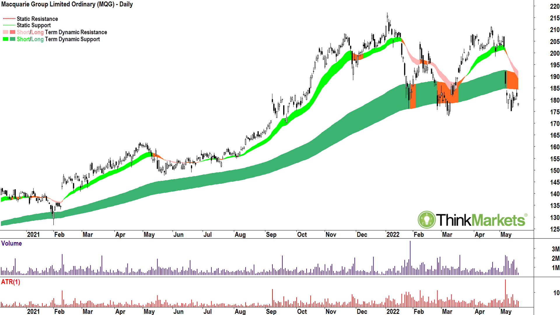
Macquarie also has a large exposure to the US economy, but also to financial markets in general. So far it hasn’t experienced the same magnitude of decline as James Hardie, but the chart above shows the risk of Macquarie dipping into a bear market is increasing.
James Hardie Industries, Russell 2000, Nasdaq. Each chart clearly demonstrates the transition from bull to bear. Each is a cautionary tale for Macquarie Group shareholders! I suggest Macquarie’s long-term uptrend is over for now, and at best, we’re in a neutral trend. However, Macquarie’s price has broken below the long-term ribbon (bearish) and appears to be failing to reclaim it (uber bearish!).
This speaks of building supply of Macquarie shares, and a demand side unwilling or unable to soak it up. The risk here is Macquarie slips into a bear market. For me, this will occur on a close below the 12 May low of $175.21.
Perhaps I could give it the benefit of the doubt and wait for a close below the 8 March low of $173.
View: Bearish, sell rallies until a close above 6 May high of $192.38.
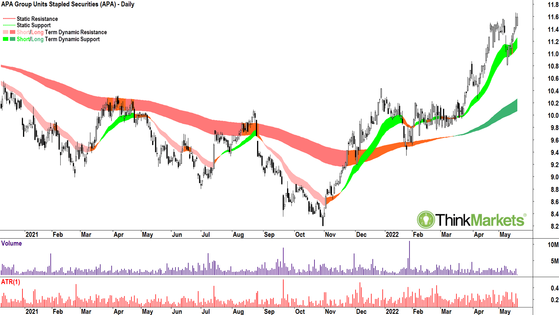
Relative strength against the broader market is always something I hunt for in charts. An uptrend in a sea of downtrends demonstrates the attractiveness of a company’s shares despite any current global macroeconomic challenges.
In this category I note several companies in the energy, utilities, and energy services sectors such as AGL Energy (ASX:AGL), Ampol (ASX:ALD), APA Group (ASX:APA), Beach Petroleum (ASX:BPT), Origin Energy (ASX:ORG) and Worley Group (ASX:WOR).
APA Group is my pick of this bunch.
Green, green, white. As in short-term trend, long-term trend, candles.
Exactly what I look for.
It tells me regardless how bad the rest of the market is, fund managers are still putting money in here, and even better, there’s very little supply getting in their way.
View: Bullish, buy dips until a close below 10 May low of $11.06.
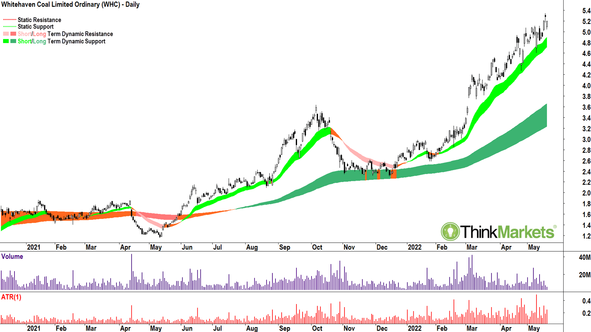
Obviously, Whitehaven Coal is also in the energy space, but coal stocks in general deserve a special mention due to their outstanding relative strength. Across the sector you’ll find several ripping charts including Bowen Coking Coal (ASX:BCB), Coronado Global Resources (ASX:CRN), New Hope Corporation (ASX:NHC), and Terracom (ASX:TER) which I featured last week.
It’s hard to go past Terracom as the best chart of the bunch, but I can’t run it two weeks in a row, can I? (SH: You totally can Carl, think of the money we’d save!)
So, this week I’ll go with Whitehaven Coal. It’s short and long-term uptrends remain immaculate. Price action is strong (higher peaks and higher troughs), and the candles remain predominantly white. I am really struggling to find fault here.
View: Bullish, but dips until a close below 10 May low of $4.60.
The views, information, or opinions expressed in the interviews in this article are solely those of the interviewees and do not represent the views of Stockhead. Stockhead does not provide, endorse or otherwise assume responsibility for any financial product advice contained in this article.