The Candlestick Returns: The bull is well and truly back if the Nasdaq hits this number

Carl's back. Via Getty
Carl Capolingua is one of Australia’s leading technical analysts. He works by candlelight way out West at ThinkMarkets, where he’s feared and admired for his unique brand of price action-based trend tracking.
In The Candlestick, Carl journeys through some of the more unknowable iterations of global and local markets.
Come. Bring popcorn. And a slide rule.
Or find him at @CarlCapolingua on the X.
Here he is, in Black and White:

The Candlestick – S2. Ep1 – Teenage Mutant Ninja Candlesticks
It’s been a little while since the last iteration of Candlestick, so for any newbs, perhaps I should do a quick recap of exactly what candlesticks are all about.
For those who don’t know me, I do charts.
Those squiggly lines on the screen which plot how the price of a stock changes over time. I use the charts to get an understanding of the balance/imbalance between demand and supply for a particular company’s shares.
It’s not that the fundamentals of a company don’t matter to me (here we’re talking the profitability of a company, its underlying business, its management, its outlook, and its value). Just that I believe everyone in the market has already made an assessment on each company based upon all available information, and based upon those assessments, they may choose to demand or supply a particular company’s shares.
These actions create the company’s price. A company’s price, and its price trend, are all I need to know about that company.
Candlesticks of Japan
Japanese Candlesticks are to charts what ninjas are to turtles. They make the mundane totally awesome (dude!).
This charting technique has been around for over 300 years. It was invented by a Japanese rice trader, who as legend has it, used his revolutionary trading technique to become the richest man in the world at the time.
The methodology is both simple and genius at the same time – most totally awesome things are.
We take the open, high, low and closing price of a trading session for any security, and draw them on a chart in a very specific way.
The price difference between the open and close creates a box which is coloured white if the close is greater than the open and black if the close is less than the open.
Any price movement outside of the box is drawn with a straight line linking the top of the box to the high of the trading session, and another straight line linking the bottom of the box to the low of the trading session.
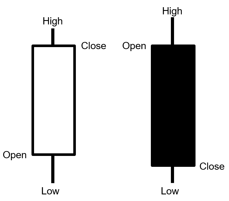
It’s pretty simple from there.
Putting gaps aside, white candles can only occur if there was excess demand during a trading session, and black candles can only occur if there was excess supply.
Downward pointing shadows are an additional indication of excess demand, just as upward pointing shadows are an additional indication of excess supply.
I want to hold and potentially buy a stock when there is excess demand for it.
Assuming the excess demand continues, the price is likely to rise and deliver me a profit.
Similarly, if I see sufficient evidence excess supply is manifesting itself for a stock, I know to reduce my risk on the stock. If excess supply becomes too severe, this is when I’ll be looking to exit the stock completely.
More tools in the box
There’s more to my technical analysis than just Japanese Candlesticks.
I also use a very specific combination of trend identification tools, price action patterns, as well as analysis of volume and volatility.
My goal is never to predict what’s going to happen next for a stock – I can’t, nobody can, the future is unknown. My technical analysis simply serves as a systematic guide as to how I increase and decrease my risk in the market.
Which kind of gets me to the final point before I better start showing you some charts.
Getting in and out are all great and stuff – but they pale in importance compared to how you manage your risk. Get that bit wrong and you won’t have any capital left. So no point looking at Japanese Candlesticks!
Risk management is a topic for another day. Let’s instead look at a few charts which paint a picture of how global risk sentiment is developing (i.e., the “macro”), and then I’ll drill down to a few ASX stocks I think are showing strong signs of excess demand.
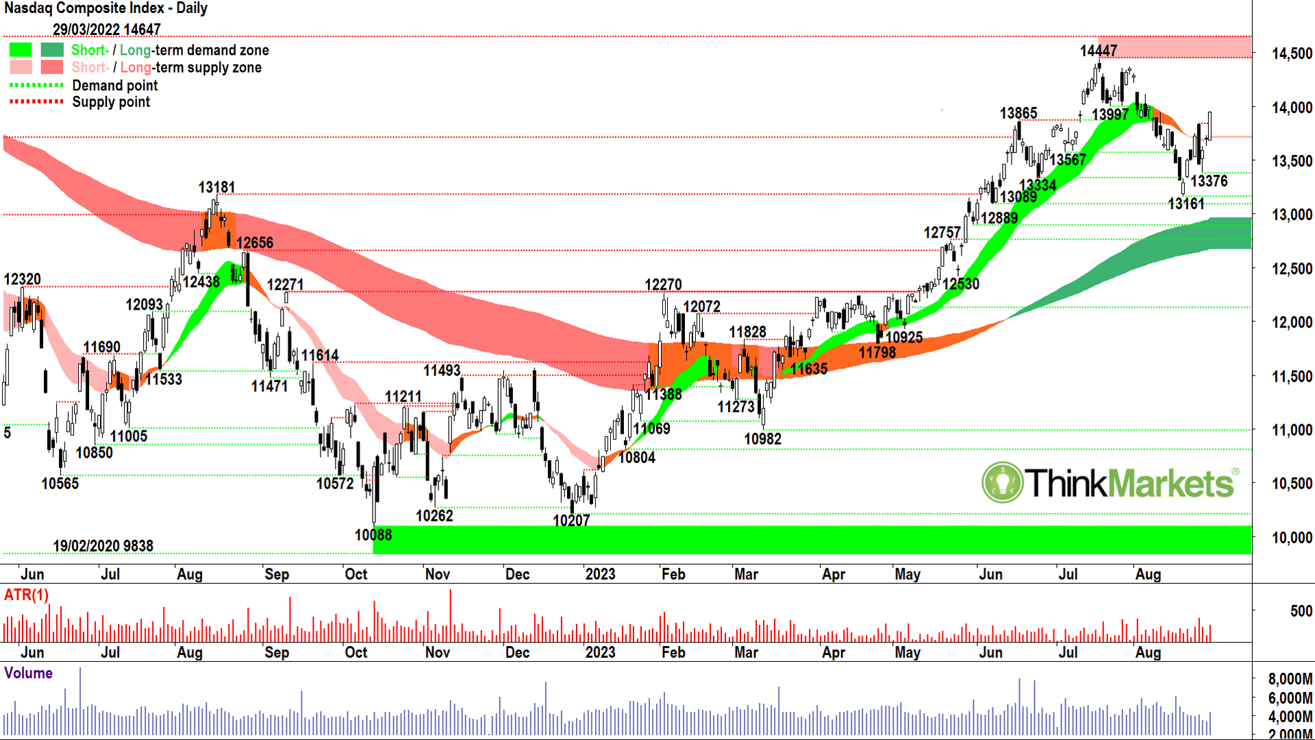
NASDAQ Composite
Stocks are risky. No, not every stock Carl. Not my banks! Not my BHP!
They’re safe.
Uh-uh. You’re kidding yourself.
Every stock has the potential to fall in value after you buy it and this is the exact definition of risk. Just ask ex-shareholders of Nokia. I could go on. I won’t.
I don’t have to, it is a fact that serious investors view stocks as risky assets.
Safe assets? Cash, and sometimes bonds.
Big “sometimes” on bonds because when interest rates go up a great deal in a short space of time, bonds are just as risky as stocks.
Stocks don’t like this scenario very much either, and it’s what’s happening right now. So here we are, in an environment of extreme risk.
This is why I like to keep tabs on the NASDAQ Composite Index.
It contains nearly 5,000 US stocks which tend to be higher growth companies in earlier stages of development than the typical well-established bellwether you’ll find in the Dow Jones Industrial Average, for example.
Early stage companies tend to rely more heavily on borrowings, so when interest rates go up, their borrowing costs usually rise and this crimps profits. Crimped profits usually results in lower stock prices.
Worse, because early stage companies’ earnings tend to be further into the future, higher interest rates mean investors more punitively discount those future earnings to a present value. This is just fancy talk for “usually results in lower stock prices”.
The NASDAQ Composite is perhaps the broadest and most appropriate measure of risk appetite for stocks in the world. It’s the canary in the mineshaft for global finance. For those who have read my previous Candlestick Editions from way back, you’ll know that I used the NASDAQ Composite to correctly call the end of the 2021 bull market, the start of the 2022 bear market, and the end of that same bear market earlier this year.
What’s my call now?
I think that the NASADQ looks healthy enough.
The long term trend (dark green ribbon) is up indicating the big fund managers are on balance still piling into risky stocks.
The short term trend (light link ribbon) is down, but has flattened out significantly as a result of the recent bounce. That bounce ticks plenty of boxes for me. It shows higher troughs (13376 vs 13161), higher peaks, and is punctuated with several large white candles/downward pointing shadows.
Volume on the last large white candle is elevated implying both increased market interest and overhead supply removal.
In short, excess demand in the long term is being matched once again by excess demand in the short term.
There’s still some work to be done to overcome the likely supply overhang created by the recent correction, and I will grow increasingly confident all is well with risk if the NASDAQ Composite can push closer to the major point of supply at 14447 over the next few weeks.
Above that point, and the bull is well and truly back.
US-10 Year T-Bond Yield
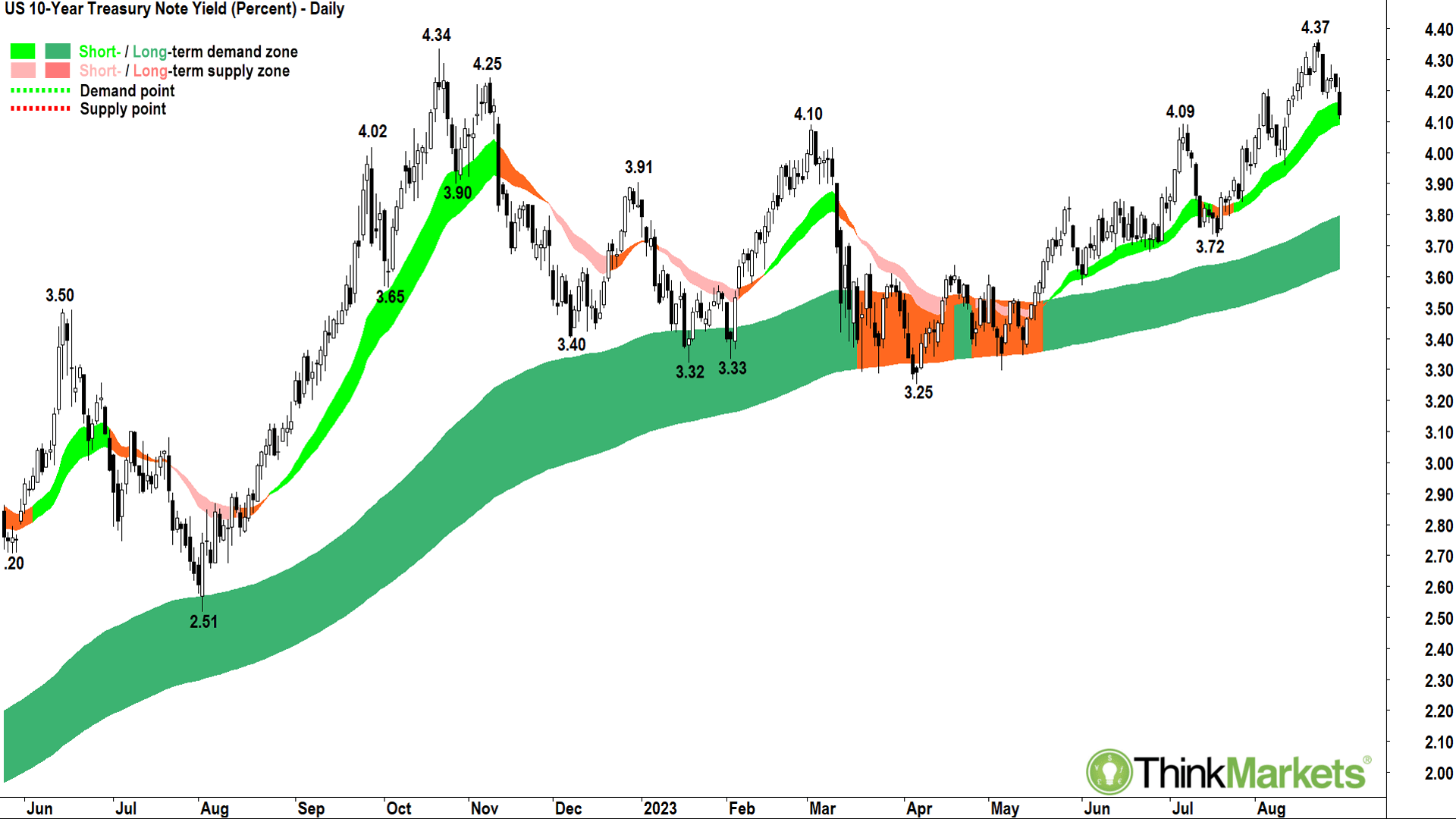
It’s all about interest rates right now. Your portfolio. Your very livelihood! Rates, rates, rates!
Stocks don’t like higher rates, or at least the uncertainty surrounding the potential threat of them.
Bond yields reflect future interest rate expectations. They must. This is because a bond’s yield should compensate a potential purchaser for the time value of money.
That time value increases the more you can earn in alternative, higher yielding assets. As central banks hike up rates, market rates (bond yields) are forced higher, and this usually puts a handbrake on valuations for risky assets.
What we’re looking at in this chart is the price of money over 10 years in the USA. It has been steadily rising from close to zero just after the pandemic, to just under 4.4% very recently.
Stocks can handle a slow and orderly rise in yields for the most part, but rapid spikes usually tank stocks.
The acceleration through late July and August in this chart is responsible for tanking the NASDAQ Composite (and your portfolio here at home). Just the same as the downward correction in this chart has facilitated the rally in the NASDAQ Composite (and your portfolio here at home!).
I’m putting this one in for those who wish to play along at home. If you want to understand why the value of your portfolio is going up or down, just keep an eye on this chart.
For now, lower equals better for stocks.
CSI China Mainland Real Estate Index

I expect you’ll agree one of the other major macroeconomic themes beating on stock prices recently is what’s going on in China, and more specifically, what’s going on with their ailing real estate sector.
In the interests of providing you with the key big picture charts to keep an eye on until the next edition of Candlestick, this is perhaps the one China chart you need to watch.
The trend is not your friend here, but it’s probably no surprise for you to see Chinese real estate stocks are in the doldrums. Again, a gradual change here isn’t going to rock the global risk boat too much, but an abrupt (read as falling off the cliff below 3400) decline most certainly will.
Whilst the long term trend (dark pink ribbon) is well entrenched to the downside, there are some signs of a potentially meaningful turnaround in the recent price action and candles. Even the short term trend ribbon (orange) is trying to wiggle its way higher. Much of the positivity is a result of concerted efforts by Beijing to stem the bloodletting, but there remains work to be done to convince me Chinese real estate stocks are on the up and up.
A move above 4100 is going to be extremely beneficial for our market, especially our resources stocks, while another rejection of the long term trend ribbon would likely send the index back towards the lows around 3400. Watch out BHP and Co. if that occurs!
S&P ASX200
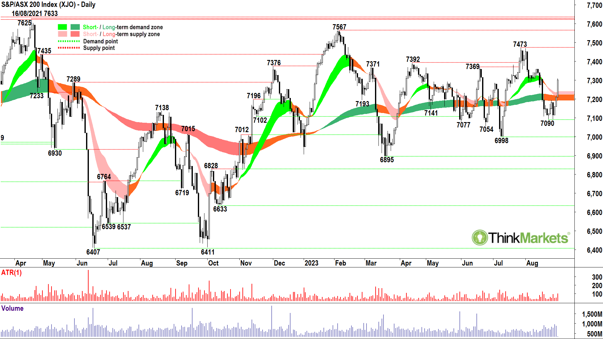
Putting all of the above macro factors together, and you get a rather dour looking Australian stock market.
The benchmark S&P ASX200 is ultimately range bound between 6895 and 7633. As we’re seeing with this latest vibration, however, there’s appears to be a tighter range working between roughly 7000 and 7500. Confirming the lack of impetus to move one way or the other, both short-and-long term trend ribbons are flat.
There is one spark of hope we can once again challenge the top of the trading range for a potential breakout. Wednesday’s large white candle is a clear and strong indication of excess demand.
We will need market interest rates to continue their recent drop, and for Chinese stocks to avoid any major near-term disasters, but I am cautiously optimistic for the local bourse.
Each day I scan the entire Australian stock market using a proprietary set of technical indicators. I then publish my Daily Shortlist along with a selection of my favourite charts on X (formerly Twitter).
Here are a few of favourite charts right now based upon my analysis of Wednesday’s close.
5 ASX stocks to watch in fluent Capo-lingua
Brambles (ASX:BXB)
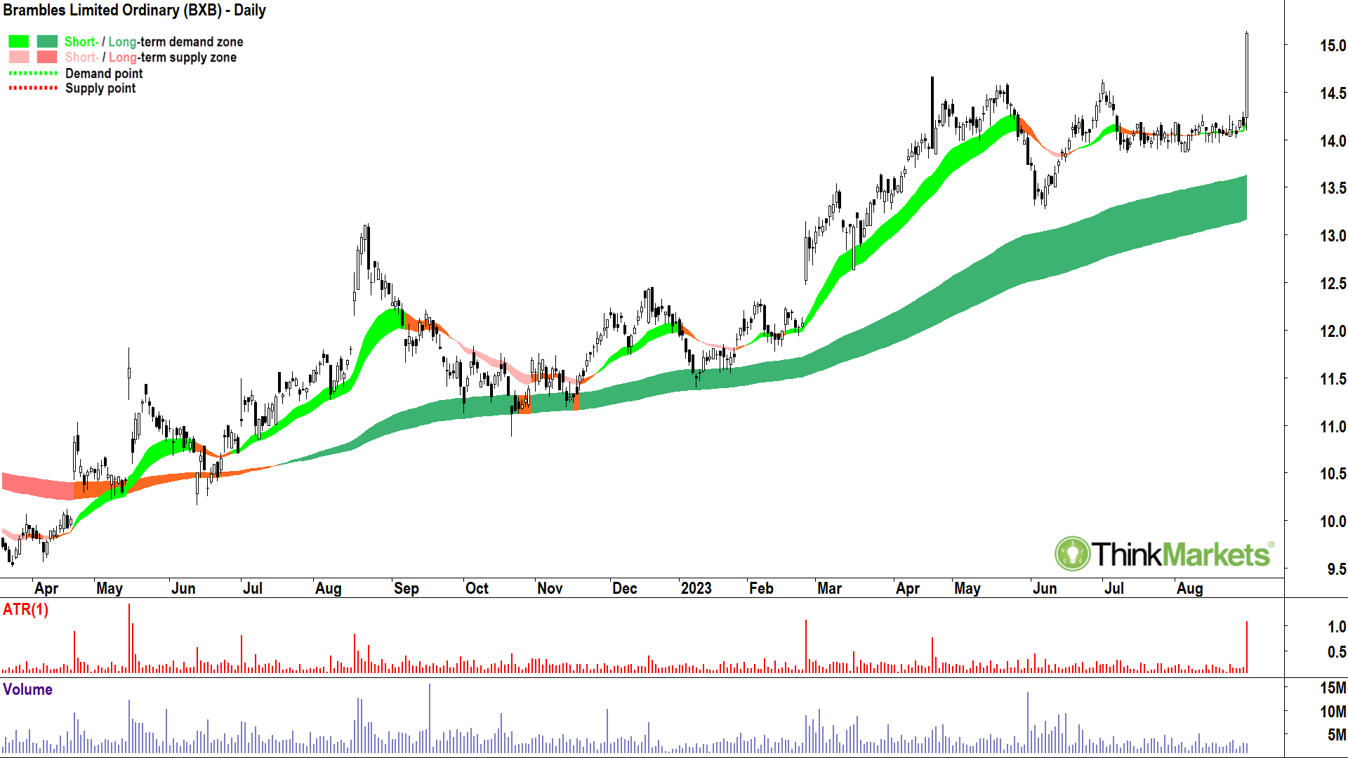
One of the many earnings season winners I’ve been able to identify in my shortlists (yes, there were a few losers also!). I first shortlisted Brambles on 24 March at $13.33 and it has made my shortlists several times since then.
It’s just a classic bottom-left-top right chart.
There are two regular setups I am looking for when perusing my charts, this, a continuation setup, and a turnaround setup which you’ll see in the last two picks below.
Many would look at that Wednesday’s massive move and say “It’s too high to buy now, I’ve missed it”. All I can see is a big white candle, and big white candles equal excess demand. I know that if I buy in an environment of excess demand, I am giving myself the greatest probability for success. Clearly, the trend ribbons and price action are also doing the right things here.
View: Happy to add risk to Brambles around current price and hold while the price continues to close above $13.75.
DUG Technology (ASX:DUG)
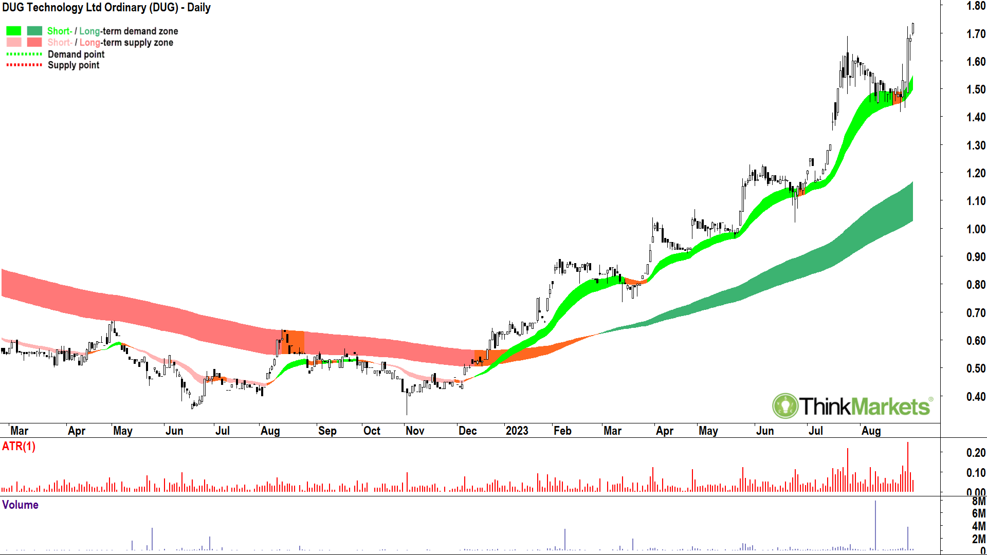
This is one of my most shortlisted charts of 2023, and as you can see from that incredible trend, for very good reason. The trend ribbons, price action, and candles are exemplary.
View: Happy to add risk to DUG Technology around current price and hold while the price continues to close above $1.40.
Seven Group Holdings (ASX:SVW)
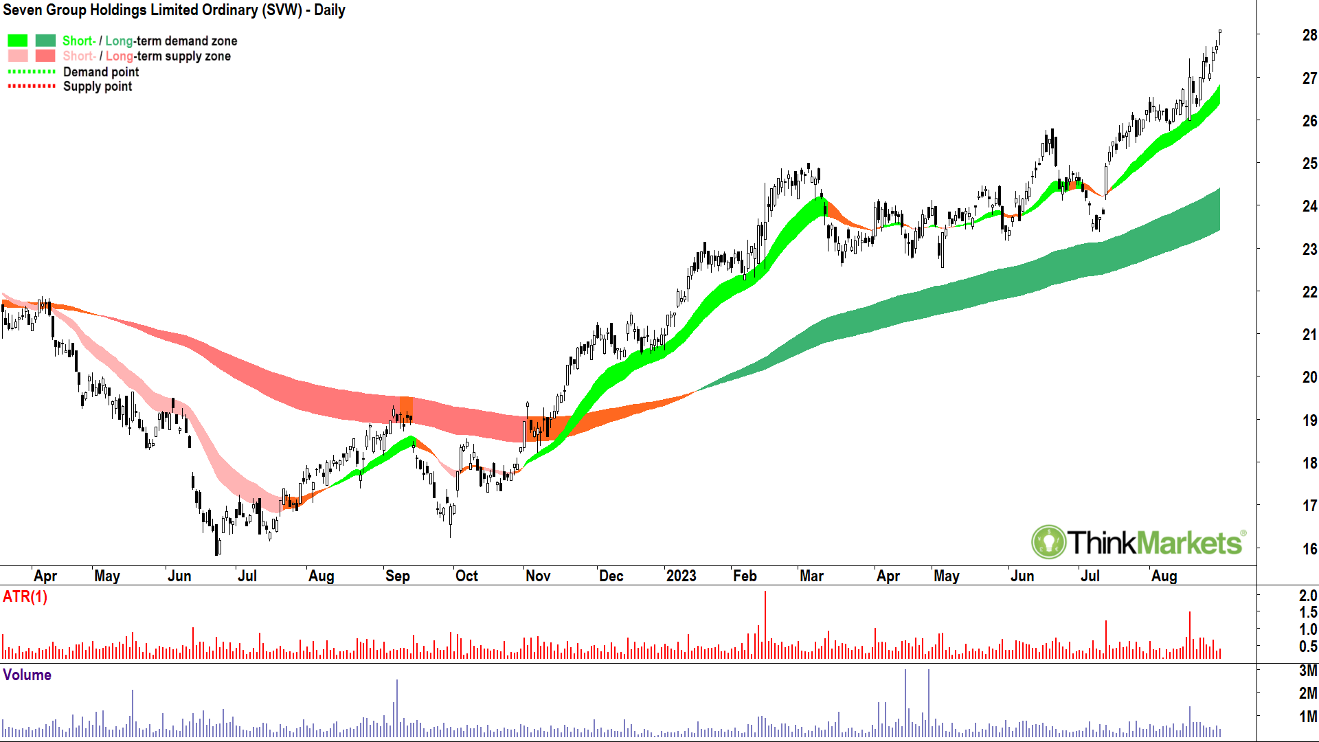
Just going to go “ditto” here. I first shortlisted SVW on January 9 at $21.99 and have shortlisted it 10 times in total since then. It’s never given me a reason to not retain at least some risk on it.
View: Happy to add risk to Seven Group Holdings around current price and hold while the price continues to close above $25.60.
Siteminder (ASX:SDR)
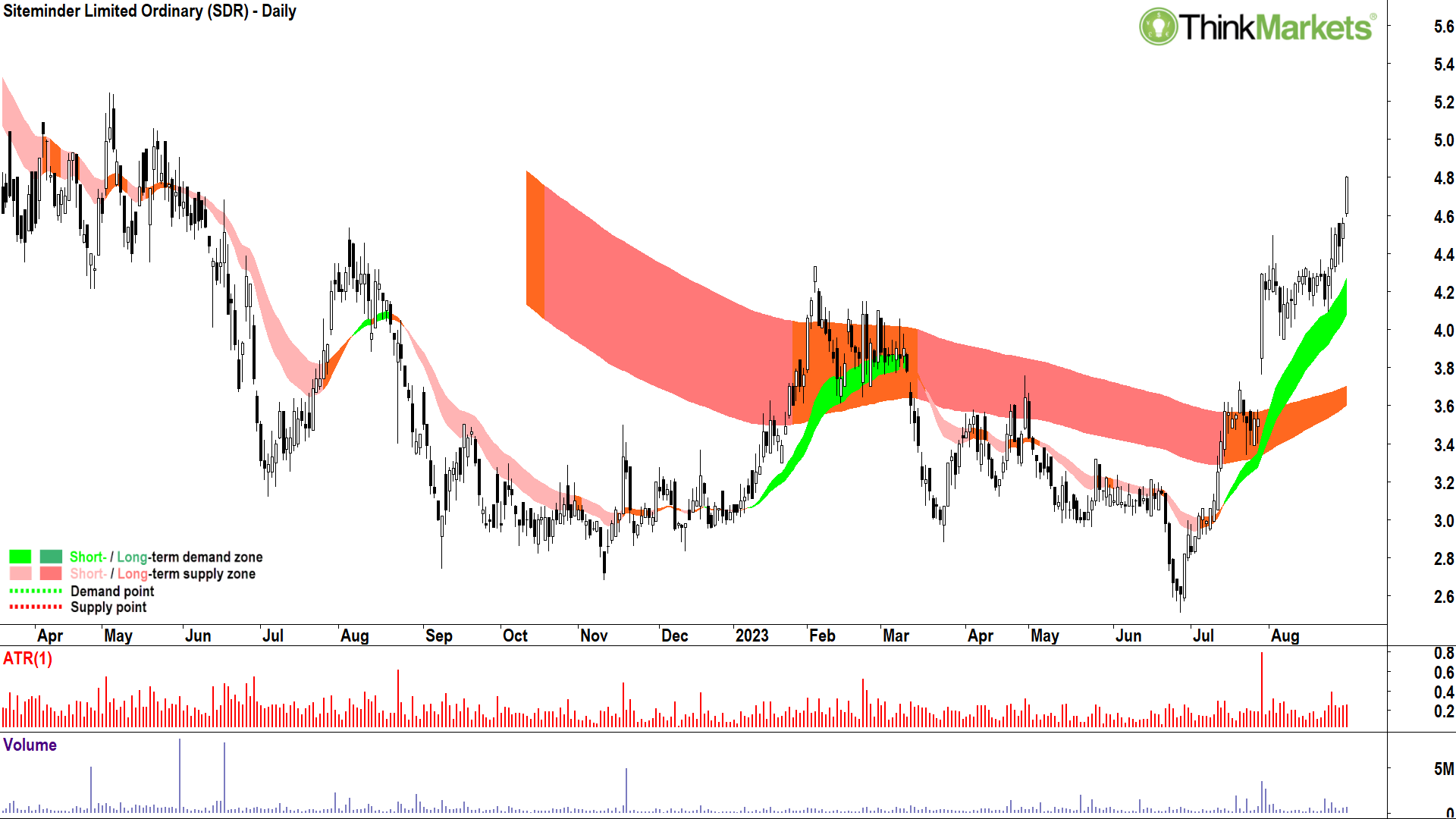
Ok, a very different chart here!
Siteminder is not the typical bottom-left-top-right chart which is my bread and butter. This is a turnaround setup where I am attempting to identify stocks which were previously beaten up by the market, but appear to be reversing their long term downtrends.
Siteminder is a more developed turnaround setup, I first shortlisted it on July 19 at $3.55. It’s made my shortlist many times since then as the short term trend has developed, the price action swung to higher peaks and higher troughs, and the candles turned predominantly green.
Most importantly, the long term trend ribbon ceased offering dynamic resistance and began offering dynamic support.
View: Happy to add risk to Siteminder around current price and hold while the price continues to close above $3.91.
Bravura Solutions (ASX:BVS)
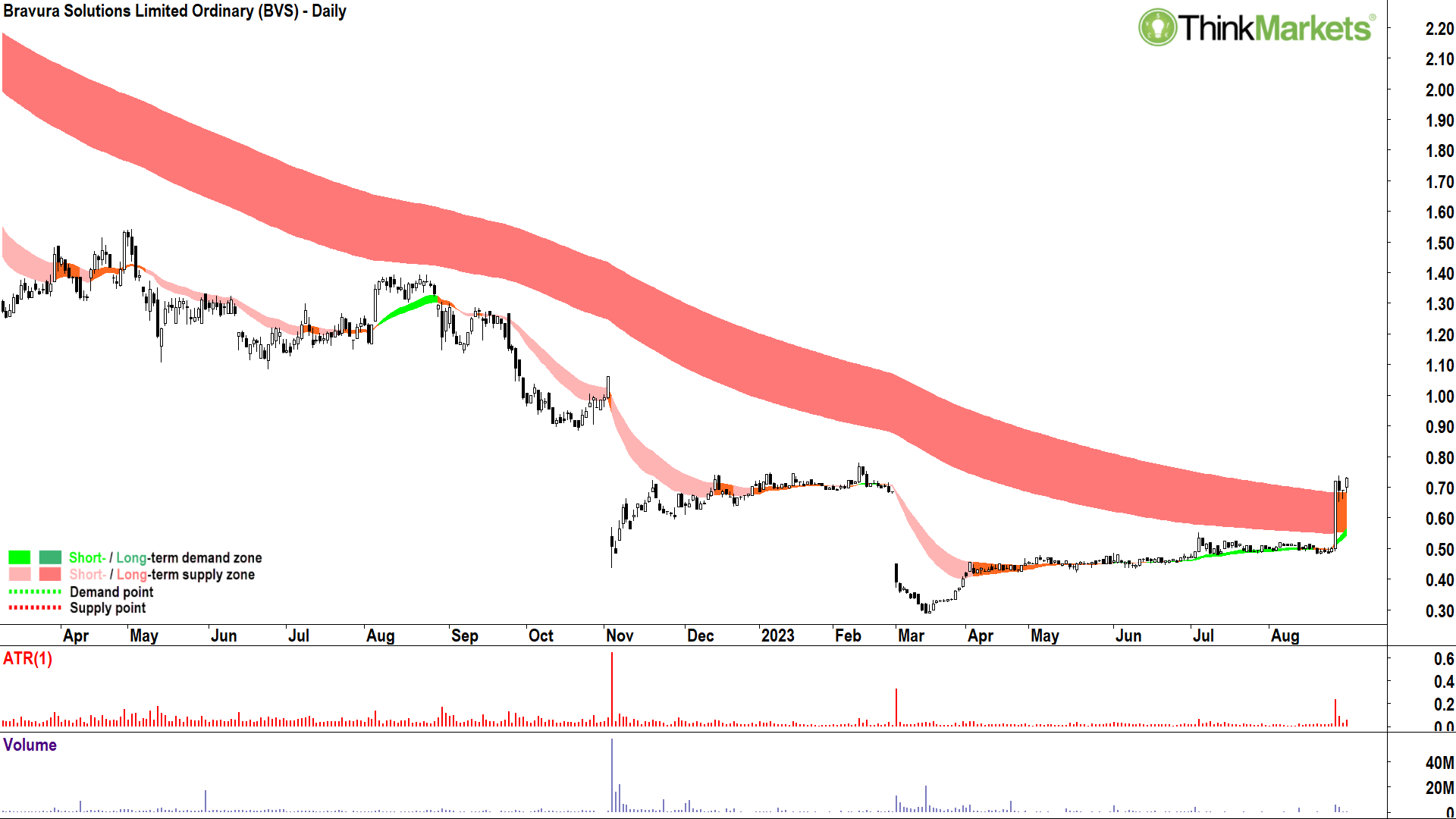
Another turnaround setup, but about as early as you will possible see me suggest one. As in, yesterday (30 August) is the first time I’ve shortlisted Bravura Solutions.
Beaten down stock? Tick.
Short term trend back to up? Tick.
Price action higher peaks and higher troughs? Tick.
Candles back to predominantly white? Tick.
Most importantly for me with this one, is that massive white candle on 25 August. Did I mention how much I love big white candles? Of course I did!
View: Happy to add risk to Bravura Solutions around current price and hold while the price continues to close above $0.48.
You can find more Carl on his Twitter page, or at ThinkMarkets.
Related Stories


UNLOCK INSIGHTS
Discover the untold stories of emerging ASX stocks.
Daily news and expert analysis, it's free to subscribe.
By proceeding, you confirm you understand that we handle personal information in accordance with our Privacy Policy.