The Candlestick: Investing with the bulls starts now

Fiesta De San Fermin Running Of The Bulls - Day 3
Carl Capolingua is one of Australia’s leading technical analysts and master prognosticator at ThinkMarkets, where he is admired for his unique style of price action-based trend tracking.
Capo has been honing his art over some 30 years of investing, advising, and managing funds.
Every week in The Candlestick, Carl will be plotting, for your sheer madness, a data-trove of unleavened technical analysis covering markets globally, then drilling fearlessly down into stock-specifics.
Here is his picture. Just in case you needed more, but didn’t know how to ask:

The Candlestick – Sixth iteration – Insert fear chip, join bulls
On Friday afternoon, I received a Teams message from one of the young whippersnappers on the TM dealing desk:
[1:09 pm] ass_ass_in_y’all
Hey Carl, will the Nasdaq hit all-time highs again within the next 1-2 years?
[1:10 pm] Carl Capolingua
let me jump into my time machine and check…
[1:10 pm] Carl Capolingua
nope-not-yet…
[1:10 pm] Carl Capolingua
2 years out now…
[1:10 pm] Carl Capolingua
still not
[1:10 pm] Carl Capolingua
3 years…there it is!
[1:11 pm] Carl Capolingua
2 years 10 months 4 days, to be precise
[1:11 pm] Carl Capolingua
mate of course it will… eventually!
[1:09 pm] ass_ass_in_y’all
lol!
No, I don’t actually have a time machine, that was my poor attempt at humour. But judging by the smiley face and thumbs up emojis popping up in response to my messages, at least ass_ass_in_y’all thought it was funny.
I did go on to explain the following:
[1:16 pm] Carl Capolingua
the question is if and when we return to the easy monetary conditions which blew the last bull market…even if we don’t, it doesn’t mean there won’t still be stuff to buy in the meantime – stuff which will go up 10, 20, 100 bags, but it just won’t be “everything at once” like it was over the last few years. i.e., you better learn how to read a chart!
[1:17 pm] Carl Capolingua
and to be fair, this crash is only a surprise if you weren’t looking at a chart…i’ve been telling everyone since Jan the USA bull was over, and since Feb the nasdaq was in a bear market = pull your head in, raise cash levels, and focus only on strong trends with the cash you leave in
Take away points from my discussion with Mr/Ms Ass_ass_in_y’all:
1. Cheap money is forever blowing bubbles. Bull markets are way easier when there’s are piles of helicopter money raining down on markets.
Too much money forces down the cost of capital and forces up valuations investors will tolerate on stocks, particularly those without near-term earnings. Case in point, our very own ASX 200 Information Technology Sector Index which hit a 1-year forward PE peak in this cycle of 78 times earnings. Prices and investor confidence skyrockets .
Helicopter cash inevitably ends up in the hands of a new generation of investors who haven’t yet had their fear chips inserted. So, really, they’ll pay anything for anything and tell themselves and each other it’s different this time (cue the hoodied finfluencer!). Prices go up because prices are going up. This is not a bad thing – this is the best time to be invested. Hot trends are everywhere, and they just keep going up. Don’t fear these times, embrace them!
2. The charts will tell you long before the market tanks it’s time to pull your head in, and certainly well before six o’clock news readers are telling you it has.
3. Investing isn’t supposed to be easy, otherwise everyone would be driving Lambos.
What’s happening now is normal, fear chips are being forcefully inserted. It’s all good. Even in the worse market, there will be opportunities if you know how to spot them, and the market won’t go down forever.
4. What happens after it does stop going down is unknown. Perhaps we get the punchbowl back, i.e., central banks break the economy too much, strap on their backpacks full of cash, and jump back into their helicopters.
Cue the next crazy bull market.
Or, probably, they don’t repeat the mistakes of the past and show some restraint this time. They let the economy and investors tough it out a bit. In this case we just get a normal market which meanders gradually, often zig-zaggedly higher over the long-term. Whilst it won’t be as easy and as fun as the first scenario, it’s still going to be a place where you can make some good money.
5. In all cases, learn how to read a chart! The trend is your friend, really it is! But don’t be ignorant to when it bends… and certainly not to when it ends! If you didn’t happen to do it this time, it’s okay. Don’t get bitter, get better as it were.
Let’s look at some charts!
Nasdaq Composite (COMP) (i.e., the chart which predicted about five months ago what was going to happen to the ASX this week!)

The left half of the Nasdaq Composite (COMP) chart is all about buy the dip.
The candles tend to be of the demand-side variety (white bodies and or lower shadows), and the price action tends to be higher peaks and higher troughs.
My short-term trend ribbons (short-term = light green zone, and long-term = dark green zone) regularly act as a cushion, and in some cases, a trampoline, pushing prices back up.
The right half of the chart is all about sell the rally.
The candles tend to be of the supply-side variety (black bodies and or upper shadows), and the price action tends to be lower peaks and lower troughs.
The trend ribbons (short-term = light pink zone, and long-term = dark pink zone), having now swung to the downside, impede upwards price movement. They act as an invisible hammer knocking prices down each time they are reached.
I can’t answer Ass_Ass_In’s question as to when the COMP will make a new high, but I can say with absolute confidence the next bull market will start by demonstrating the tell-tale signs the balance between demand and supply has swung back to the demand-side.
So, as per two paragraphs ago, demand-side candles, higher peaks and higher troughs, light green and dark green trend ribbons. Until then, trust the prevailing downtrend. To see some case studies of exactly what to look for at the start of the next bull market, check out this previous edition of The Candlestick.
Since our last update, the COMP has continued in trend, and cracked through key support at the 20 May low of 11,035. It appears to be finding some tentative demand at a previous key demand point in the 24 Sep 2020 low of 10,519. Friday’s volume spike is likely solely related to stock and index options expiry on 16 June, and therefore is unlikely to indicate the commencement of a capitulation phase. It’s hard to find a shred of bullish intent until we see such a capitulation by ways of a long lower shadow with accompanying massive volume spike.
The pre-COVID crisis bull market high of 9,838 set on 19 Feb 2020 is a potential candidate for where a capitulatory move lower may probe.
To the upside, the short-term trend ribbon is going to continue to nag away at both demand and confidence. It’s going to kick in around the 15 June peak high of 11,244. I’d prefer a close above the 2 June high of 12,320, however, before even contemplating calling this COMP bear market over.
View: Bearish, sell rallies until a close above 12,320.
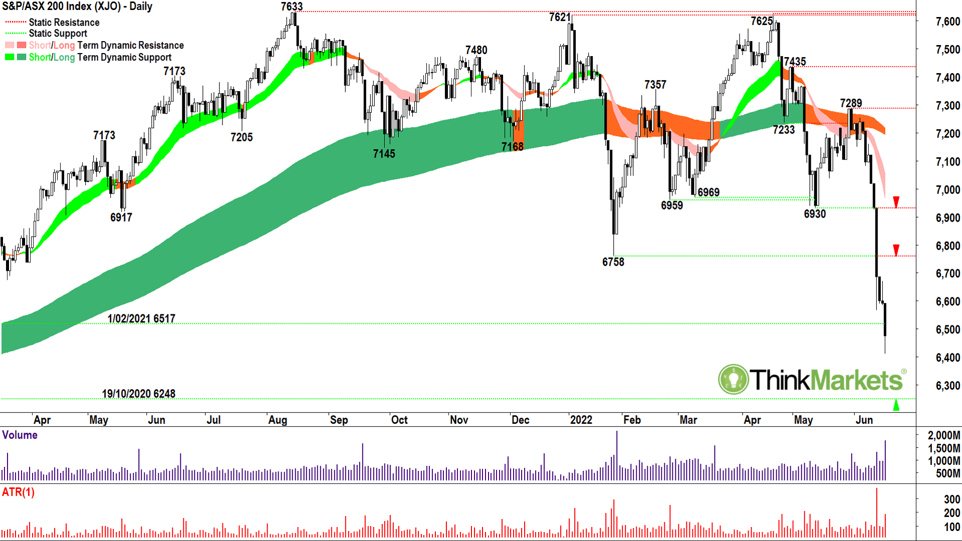
S&P ASX200 XJO How high can a Gruber bounce?

Last Candlestick, we pondered whether the Australian stock market was about to get Grubered.
Well, yes, it did – splat!
Not only did the potential demand point of the 27 Jan low at 6,758 go, so too did the 2021 low of 6,517. A small bounce by Friday’s close, even though accompanied by some decent volume, is unlikely to signal the end of the new short- and long-term downtrend.
Vertical moves down are not the norm. They occur when motivated supply meets a demand-side vacuum, i.e., holders of shares want out but there’s very little money looking to get in the way of their selling, even at increasingly lower prices. Usually, lower prices entice out the bargain hunters, but not in this case. So, think just how bearish last week’s scenario is – no price looked attractive to step in and take on the risk!
Considering just how convincing last week’s supply-side candles are, my tip is that even if we do see a reprieve in the selling, it’s unlikely there will be enough demand flooding in to trigger much of a bounce. A big drop, followed by a relatively muted bounce, is often referred to in the markets as a “dead cat bounce”. As in, if you drop a dead cat from a great height, how high does it bounce?
Not very high.
If any bounce in the ASX200 does occur, is likely to be hampered around the short-term downtrend ribbon which is going to kick in between 6,900 and 6,950. Note also, the 6,758 previous demand point will now likely act as a supply point.
Supply side candles at either of these levels will indicate the likely limit of the dead cat’s bounce.
Potential points of demand usually line up with historical points of demand. In this respect, watch out for signs of excess demand around the 19 Oct 2020 low of 6,248. For a rally to perpetuate, you’d want to see a cluster of decent demand-side candles down there, preferably with an influx of volume. Still, I couldn’t get too excited about a meaningful low until I also saw higher peaks and troughs, and ideally a close back above 6,758 as well as the short-term trend ribbon.
View: Bearish, sell rallies until a close above 6,758.
It was the worst of times, it was the best of times
I didn’t want to make this week’s Candlestick all doom and gloom.
When markets tank as they did last week, I am always fascinated by those stocks which bucked the trend. Stocks which meet all of my buy criteria regardless of the carnage.
This is called Relative Strength Comparative (RSC, not to be confused with the popular technical indicator Relative Strength Index (RSI)).
I only look to buy stocks which demonstrate sufficient excess demand in their charts. But think about how confident the demand-side must have been in the following charts to keep buying despite the broader market selloff. Similarly, consider just how devoted the sell-side must have been to hold on whilst everyone else panicked. It speaks volumes about the prospectively of these companies.
So, for your charting pleasure, I list my five most interesting RSC winners from last week.
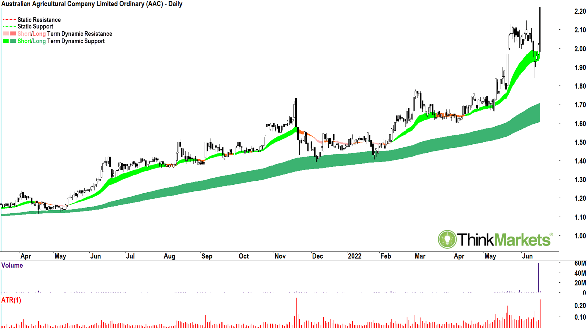
Australian Agricultural Company (AAC)

Bottom left, top right. Just a picture of excess demand.
It did start the week with a push below the short-term trend ribbon – but which stock didn’t get belted on Tuesday?
That corresponding 14 June candle is everything you want to see after your stock has had a minor pullback. Wednesday, solid. Thursday, excellent. Friday, freak’n amazing!
Of course, market meltdowns are easier to navigate if Twiggy Forrest just snapped up another 10% of your stock.
If you own AAC, I cannot see any reason in the chart to sell it. If you don’t own it, I can’t see any reason in the chart why you wouldn’t.
View: Bullish, buy pullbacks until a close below the 14 Jun low of 1.84.
Capricorn Metals (CMM)

Not completely bottom left, top right, but there’s plenty for a trend follower to like about the chart of WA gold miner Capricorn Metals. Tuesday’s candle reached into the long-term trend ribbon and found a bunch of buyers despite the broader market’s 200-plus point selloff.
Wednesday, Thursday – each was solid in terrible market. And then Friday – boom! The price closed above the short-term trend ribbon accompanied by a commendable volume push through a bunch of pesky supply around 3.80. The close was smack bang on the high of the session, also impressive.
The only thing which stopped the buyers from grabbing more stock was… ding, ding, ding, the closing bell.
View: Bullish, buy pullbacks until a close below the 14 Jun low of 3.23.
Diatreme Resources (DRX)

You wouldn’t know the ASX200 was in a long-term downtrend looking at this chart. Diatreme Resources is working towards a Definitive Feasibility Study for a potential mine at its Galalar Silica Project in North Queensland.
Things I like about this chart: Excellent short-term trend developing since April, including a major demand event on a huge influx in volume in late-May; This removed a great deal of dead wood supply, which judging by the shallow nature of the pullback to the short-term trend ribbon since, is now angling to get back in; Friday’s candle is a monster in terms of excess demand.
The long-term trend ribbon staring to gather some upside momentum. Things I don’t like about this chart: Socceroos vs Peru…Nil-Nil!
View: Bullish, buy pullbacks until a close below the 17 Jun low of 0.029.
Polynovo (PNV)

Okay, the long-term trend ribbon is not shooting the lights out in the chart of med-tech Polynovo. That pesky dark pink zone has bullied the price lower for a year now. But, despite the market’s massive plunge this week, Polynovo logged three out of four very solid demand-side candles.
The short-term trend ribbon looks intact, and it’s doing a commendable job of holding up the recent price action. Friday’s candle and volume combination speaks of substantial supply removal – and supply removal is exactly what Polynovo needs if it is to break the shackles of that long-term downtrend.
A close above the 16 May high of 1.415 is going to be very interesting.
I’m comfortable giving this one the benefit of the doubt and will officially declare the long-term downtrend “over” if this occurs.
View: Neutral, happy to switch to bullish on a close above 1.415.
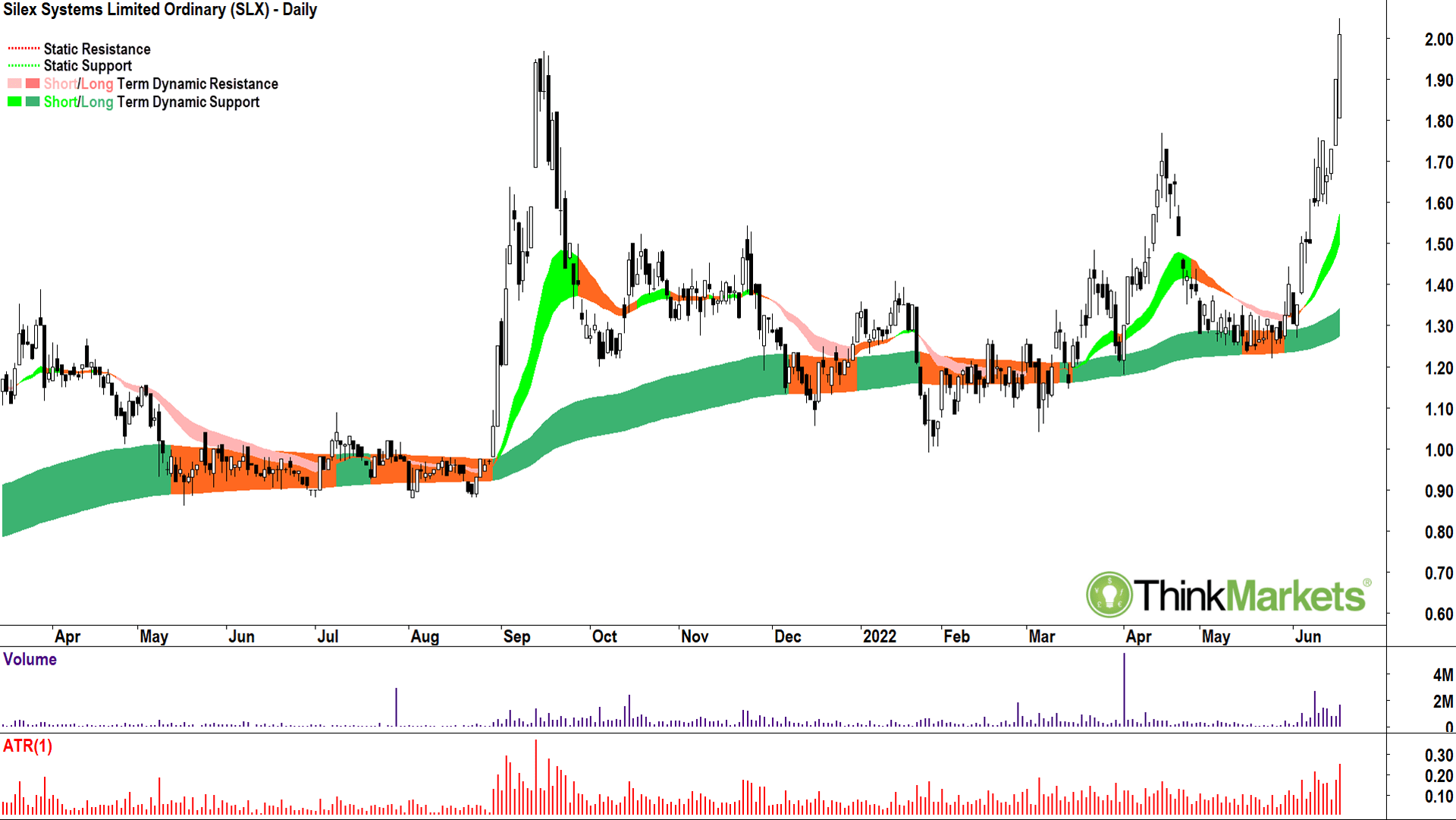
Silex Systems (SLX)

Last, but certainly not least.
Uranium enrichment technology developer Silex Systems just logged its second week of gains.
Most of the candles over this period, and since the resumption of higher peaks and higher troughs occurred on 3 Jun, have been very solid demand-side candles indeed. Add in fantastic short- and long-term trend ribbons, and a close above the key potential supply point from the 15 Sep 2021 high of 1.97 and there’s everything to like about this chart.
Once again, a picture of excess demand.
View: Bullish, buy pullbacks until a close below the 14 Jun low of 1.595.
Until next week,
Candle-out.
The views, information, or opinions expressed in the interviews in this article are solely those of the interviewees and do not represent the views of Stockhead. Stockhead does not provide, endorse or otherwise assume responsibility for any financial product advice contained in this article.
UNLOCK INSIGHTS
Discover the untold stories of emerging ASX stocks.
Daily news and expert analysis, it's free to subscribe.
By proceeding, you confirm you understand that we handle personal information in accordance with our Privacy Policy.


