Trading with focus: What the dark art of charting can teach us about gold investments

Pic: DKosig / iStock / Getty Images Plus via Getty Images
This week, we’ve dialed in on technical trade patterns, and how chart insights can be used as both a direct trading strategy as well as a complementary weapon in the arsenal for value investors.
In our experience, investors who take a long-term ‘buy and hold’ approach will often scoff at technical traders. After all, in-depth research on company valuations or economic trends seems a far cry from making investment decisions based on lines off a chart.
But is there something to learn from the dark arts of charting? At the very least, it doesn’t hurt to have an understanding of how it works.
For readers looking for an introduction to the technical side, we’ve set out an explainer below to illustrate how charting patterns can be used to make informed investment decisions.
Marketech Focus has a lot of easy-to-use charting tools, so knowing how to use them might help you time an entry (or exit) to a given stock once you’ve decided it’s a buy or sell.
(At worst, it can help ease the pain of a bad decision — ‘the chart failed’ is a favourite saying among technical traders!)
Simplicity in patterns
As we know, patterns reveal themselves in all facets of life including stock markets. Investors aren’t immune to behavioural bias, and if enough of them (the ‘herd’) all think the same way, some patterns can then become self-fulfilling.
In a perfect world we would all turn at the same place in the stock market and know where that point was each time. But it’s also those differences in opinion and the ‘herd’ mentality that create the opportunities.
That’s the turning point that we’re looking for, and it’s also why technical analysis can often work as part of a broader trading strategy.
Chart patterns can also be really handy for helping to let a winning trade run, or for exiting a losing trade without emotion – because a lot of technical trend analysis is about spotting which direction the herd is running in.
To see how to set up the charts on Marketech Focus watch the short video here:
Breaking down the gold market
In that context, charts are just a visual representation of which way the ‘herd’ was running over a period of time. Initially all charts can look random, with little or no obvious patterns. But the longer you look, the more things seem to line up.
To illustrate, we’ve run the ruler over three gold charts — a topical market trend given prices for the precious metal are holding near all-time highs.
Looking at the broader market, the pricing patterns for a standard gold exchange-traded fund (ETF) highlight some interesting trends.
With the benefit of hindsight (always a wonderful thing), what trends were starting to reveal themselves in the chart pattern?
The main one that stands out is that from 2014 onwards, gold maintained a steady uptrend with consistently higher highs:
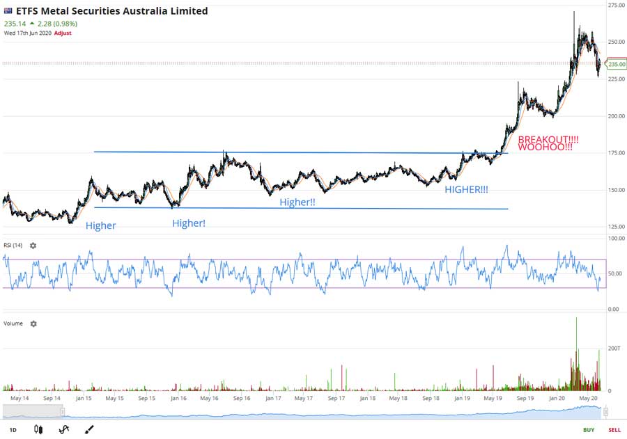
The data shows a series of steps up across 2014, 2015 and 2016, and each time it sold off it had higher lows. (Think of the ‘herd’, waiting for the selloff that didn’t come — each time they see it run a bit higher, they know they’ll need to pay a bit more).
In retrospect, the chart clearly showed a bullish long-term setup ahead of the 2019 breakout.
Turning to a gold company, Evolution Mining (ASX:EVN), we can use daily chart analysis to show how different technical indicators can provide a more informed view:
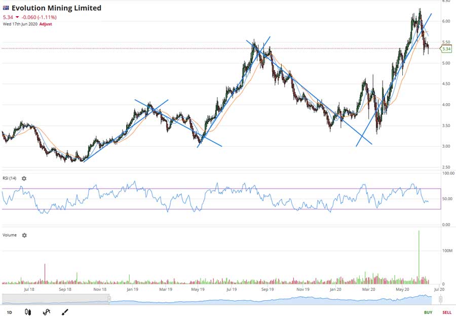
What an awesome chart. It went up for quite a while in a straight line, then down for a while (in an almost straight line), then it did it again and again!
Of the simple indicators we’ve included, look at the crossing of the moving averages — buying EVN shares at those crosses would have resulted in some great returns.
As an example of the different setups available in technical trading, we’ve also included EVN’s position on the Relative Strength Index (in between the purple parallel lines).
Interestingly, the RSI on the daily chart had next to no indicative pattern at all. As a technical indicator, the RSI is supposed to show when a stock is ‘oversold’ or ‘overbought’ by taking out the market noise, but in this case it was no help at all.
However, look at the same chart with a weekly timeframe — longer terms, less noise:
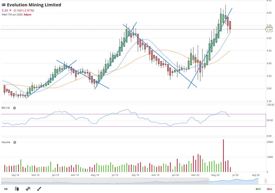
On this basis the RSI was more informative, with its peaks and troughs correlating much better with the price chart.
But those same moving averages on the daily chart are now the ‘poor cousins’ on the weekly. The moving averages would not have highlighted it was time to sell until well after the run had ended (it still would have been a profitable trade though).
So, armed with just this basic set of simple moving averages and the RSI, we can see the EVN chart patterns may have been indicating some strong returns were on offer, but it doesn’t in each case – so next week perhaps we can talk about stop losses.
And as a pure technical trader would say: “What does this company even do? Doesn’t matter…”
Trade Up to Marketech Focus — a high-function trading platform from $45 per month. Instant trading capability for both PC and mobile to keep you on the move.
As a subscriber you will have access to brokerage starting at $5, and then 0.02 per cent for trades over $25k. Go to www.marketech.com.au to set up a free trial.
This article was developed in collaboration with Marketech Stockbroking Pty Ltd (AFSL 486148), a Stockhead advertiser at the time of publishing.
This article does not constitute financial product advice. You should consider obtaining independent advice before making any financial decisions.
Related Topics

Related Stories


UNLOCK INSIGHTS
Discover the untold stories of emerging ASX stocks.
Daily news and expert analysis, it's free to subscribe.
By proceeding, you confirm you understand that we handle personal information in accordance with our Privacy Policy.