Think Big: The ‘velocity’ of money, and how the US economy has put the brakes on

(Getty Images)
Since the 2008 financial crisis, much has been made of the economic support measures taken by global central banks.
Interest rates were slashed to zero in the US and Europe, while banks commenced purchases of government bonds to maintain liquidity in the financial system.
At the time, no one knew what the effect of such an aggressive policy response would be (for example, some economic theory suggests low interest rates can give rise to excessive inflation).
But the prevailing decade has been something of a puzzle, for policymakers and investors alike. Speaking with CNBC last year, Warren Buffett described it this way:
“No economics textbook I know that was written in the first couple of thousand years discussed even the possibility that you could have this sort of situation continue, and have all variables stay more or less the same.”
Inflation is still nowhere to be seen. Economic growth has been steady, although productivity (economic growth per capita) has been falling in most developed economies.
And while wage growth has stagnated, asset prices — led by equities and residential property — have been on a steady march higher.
The result is that while policy settings have been broadly supportive, many feel the benefits of growth haven’t flowed into the “real” economy.
While low productivity and low inflation are difficult puzzles to solve, these two interesting charts from the St Louis division of the US Federal Reserve help illustrate how global financial conditions have changed over the past decade.
The charts are US-centric, but they still provide a useful guide to the trends underway in other developed Western economies.
The first highlights the growth in the MZM (money with zero maturity) supply — the broadest available measure of all the liquid cash circulating in the US.

The MZM has been steadily increasing since the turn of the century and that growth has accelerated since 2008.
And to illustrate the effect of central bank policy, it’s clear the MZM has taken a sharp detour higher this year in the wake of emergency policy measures to combat COVID-19.
Accompanying the MZM money stock data is a gauge of how fast all that money is changing hands in transactions — MZM Velocity:
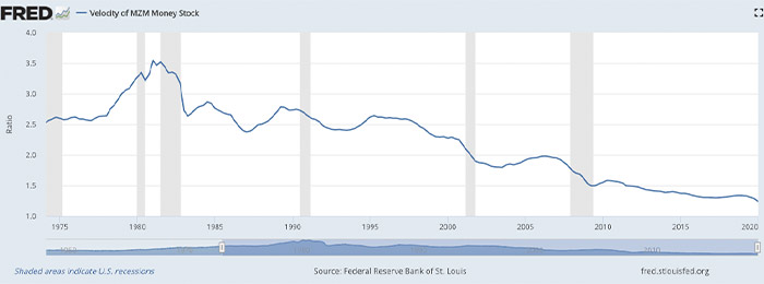
So while the overall money supply has been steadily increasing, the speed at which that money is circulating has been on a steady decline. Along with MZM, the velocity of M1 — defined more narrowly as the money supply of currency in circulation — has also fallen steadily in that time.
As the St Louis Fed explains:
“A decreasing velocity of M1 might indicate fewer short-term consumption transactions are taking place. We can think of shorter-term transactions as consumption we might make on an everyday basis.”
Adjacent to that, the velocity of MZM “helps determine how often financial assets are switching hands within the economy”, the St Louis Fed said.
The timeline on the chart above dates back to 1975, to illustrate when MZM velocity peaked at a ratio above 3. That’s important, because the period in the late 70s and early 80s is also the last time the US economy faced a bout of serious inflationary pressures.
Based on the direction of that chart line, MZM velocity doesn’t look set for a rapid rise any time soon.
But the data suggests that understanding the impact of money velocity can be a useful indicator in determining whether the outlook for inflation — and by extension interest rates — could be set to change.
Related Stories


UNLOCK INSIGHTS
Discover the untold stories of emerging ASX stocks.
Daily news and expert analysis, it's free to subscribe.
By proceeding, you confirm you understand that we handle personal information in accordance with our Privacy Policy.