The Candlestick: Gold Spot; Gold vs Yield; Gold vs $$; And Carl’s Top 6 ASX Gold Sector Charts

Picture: Getty Images
Carl Capolingua is the only Australian technical analyst you will meet in this story.
He works by candlelight at ThinkMarkets and lives with the little candelabrums in the western state that does what it wants, when it wants and where they admire his unique brand of price action-based naked trend tracking.
Capo just wrote a bear market survival guide and has been honing this art over some 300 years of investing, advising, and managing funds.
Every week in The Candlestick, Capo muscles into the unknowable iterations of markets – global, local and then rips into the very stocks that drive them.
Here he is with a little photoshop:


The Candlestick
Iteration 2, 2023: “Always believe in… Gold!”
Gold Bugs. Bless them.
As the wise and well dressed fund managers of Spandau Ballet once proclaimed…
True Gold Believers hold as unalienable, these self-evident truths :
- A certain shiny yellow metal forged in ancient times within the belly of a volcano is the only valid financial asset.
- That this precious metal is the one store of value to rule them all!
- That if there was logic and reason and a God, we’d all be paying for loaves of bread with shavings of gold.
Fiat? Ha.
Crypto, you deign? There are but the false idols of a Neo-transient blasphemy and mere gold to fools.
Aye. One thing is for certain about Gold Bugs: They never lose their faith.
Despite the constant ‘slings and arrows of outrageous fortune’, the next big move in gold is always somewhere just around the corner.
Economy overheating? Buy gold because hyperinflation is on the way!
Markets in the toilet? Buy gold because The Fed’s are sure to print their way out of trouble!
“This time next year I predict gold will be trading at…(little finger to corner of mouth) One Zillion dollars!”
The only problem is, the next big move – that stratospheric explosion of demand – has up to this point not materialised. Still, Gold Bugs would have you awaken to the truth that the current banking crisis is the latest and greatest trigger for gold’s impending time to shine.
Maybe they’re right. Perhaps the banking system is on the verge of implosion and the money printing presses at the Fed, the ECB, and the BOJ are about to be switched to warp speed and trigger the hyperinflation Gold Bugs have so long salivated for.
I don’t know. I am but a traveler on this. As I have mentioned in previous editions of The Candlestick, I can’t see the future.
My impediment is hardly a setback, however.
As a trend follower, I prefer my charts, and more specifically, my candlesticks to help guide my decisions as to whether to add or reduce risk. You could say candlesticks are my black and white gold.
I’ll admit I’m not a Gold Bug.
This is for two main reasons. Firstly, because I can’t see the future, I concede I must follow the price trends created by the balance or imbalance between the forces of demand and supply which always know better than I do. And secondly, because of the first reason, it’s not a good idea to get sold on a narrative like “Gold is going to do X because of Y”.
A “narrative” in investing terms is simply a plausible theory as to why the price of a stock or an asset should rise or fall. I’ve touched upon the narrative of your typical Gold Bug, but there are many more narratives alive and well in the markets today. For example, “EV demand is going to drive the demand (and therefore higher prices) for lithium minerals for the next decade”.
In my experience, it’s not a good idea for an investor to get stuck on any narrative. Indeed, getting stuck on a narrative can be downright deadly to one’s portfolio! This is because believing in a narrative too long may cause the investor to hold onto a stock or group of stocks tied to that narrative for far longer than the price trends of these assets suggest.
Look at the chart of 2020 and 2021’s best performing stock, Novonix (ASX:NVX), as a prime case study and warning to those who believe in narratives too long. It went from 20 cents to $12.50 on the narrative that the battery materials they produce were going to change the way we power our cars for decades. Maybe. But now NVX shares are trading way back down to around $1, and they’re still heading south.
Zip (“Buy now pay later is going to revolutionise the way we pay for stuff, sales and total addressable market is a valid way to value a company”) and Domino’s Pizza Enterprises (“We’re all eating pizzas at home during the pandemic and Domino’s is defensive, it’s downright blue chip!“) are two more recent examples of narratives which caused investors to hold onto a stock all the way back from hero to zero. But history (and possibly your portfolio) is littered with examples of other narratives which seduced investors into hoping the good times are still just ahead.
Back to gold…

Personally, I love gold when price trends suggest it’s going up.
I’m happy to load up on it via futures or CFDs, and to also add risk by adding gold stocks whose own price trends are reflecting the underlying appreciation in the gold price. But if the charts don’t suggest this is the case, then I am completely, totally ambivalent. I am only ever in gold for a good time, not a long time – a temporary Gold Bug when conditions suit!
So, let’s look at the charts for gold, some of the key factors currently driving its price, and some of the stocks which may benefit from a potential gold bull run. To the candlesticks we go!
Gold vs Yields vs Stocks Relative Performance

This chart compares the performance of spot gold to the US 2-Year T-Note yield and the S&P ASX200. The 2-Year T-Note or “2-yr” as I’ll refer to it here, is considered the benchmark for short-term interest rates in America. It’s basically telling you what the price of money is in the short-term in the US economy (longer-term, you’re going to want to look at the 10-Year T-bond yield, and for mortgage rates, the 30-Year T-bond yield).
US bonds represent the price of money over various timeframes, and as the US dollar is still considered the benchmark global reserve currency – they also represent safety (Gold Bugs just threw up a little in the back of their throat as they read that!). Alas, Gold Bugs, in the financial markets of March 2023, gold is considered rightly or wrongly as “the other” safe-haven asset.
Yields on US bonds is therefore crucially important for gold because gold doesn’t have a yield of its own. Worse still, you’ll typically have to pay someone to store your gold deep underground and stand in front of it with a shotgun. So, if you can earn more on an alternative safe-haven asset than it costs you to hold gold – that’s bad for gold.
This is evident in the chart above as during the periods where the yield on the 2-yr was rising, the price of gold was steadily falling, and vice versa. Not the topic of today’s conversation – but relevant if you own shares (I’m assuming you do), higher interest rates also typically have a negative impact on stock prices. So, a little weirdly, gold and stock prices have been moving together, and both have been moving in opposite lockstep with yields.
I say “a little weirdly” here, because if gold is to be the “great hedge against whatever bad is about to befall mankind” then this really shouldn’t be the case. Anyways it is, or at least it was… until you guessed it! Da-da-dum! The 2023 #BankingCrisis!
Why? Well, as you can see, the gold-to-stocks positive correlation breaks down around the time US banks started falling over, yet the inverse relationship between gold and yields continues. This is because 2-yr yields plunged on the belief the Fed’s backstop lending program aimed at shoring up liquidity for US banks is really just another form of quantitative easing (QE), or money printing. Gold Bugs just love talk of money printing!
Even better, investors quickly switched their view the Fed would continue its crusade against inflation at all costs to cutting rates to sandbag the US economy against the spectre of a banking sector induced credit crunch. An environment which is good for safe-haven assets, and which features lower yields, represents a win-win situation for gold.
Going forward, if you do decide to become a Gold Bug, you’ll need to monitor the relationship between gold and yields, as well as understand how a change in yields impacts the gold price. If yields go back up – possibly because the Fed hikes rates as it prioritises the fight against inflation over the health of the US economy – then that’s probably bad for gold. Alternatively, if the Fed is forced cuts rates and print money to rescue the US economy – then that’s probably good for gold.
Gold Spot XAUUSD
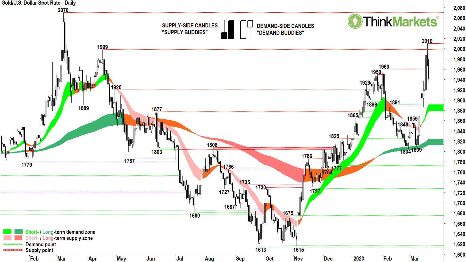
Now to the gold price itself. I like to start my technical analysis by ascertaining a stock’s short-and long-term trends. The short-term trend (light green ribbon) and long-term trend (dark green ribbon) are both pointing up, with the long-term trend being confirmed with a classic double bottom pattern at 1804 and 1809 on 28 Feb and 9 Mar.
Next, I look at the price action which investigates the positioning of recent peaks and troughs. NCM’s price action shows higher peaks and higher troughs which is an indicator of building demand and diminishing supply.
Finally, I go to my all-important candles. They show an impressive surge of demand-side candles since the 9 Mar low. Remember, demand-side candles are those with white bodies and or downward pointing shadows. Demand-side candles demonstrate there is more demand (i.e., cash) seeking gold (i.e., supply), and at increasingly higher prices to get set. The larger the candles’ white bodies, and or the longer their downward pointing shadows, the more motivated the demand-side is, and the greater is the excess of demand over supply.
US$2,000 is not only a key potential psychological supply point, but it’s also an historic supply point from 18 Apr 2022. One should not simply assume supply here, though. Confirmation should be sought via the observance of supply-side candles. These are candles with black bodies and or upward pointing shadows.
It is clear from the candles on 20 and 21 Mar, there is indeed a substantial amount of latent supply around US$2,000/oz. We should expect supply isn’t going to be overwhelmed with a single push. So, it may take some time for the demand-side to work through the US$2,000/oz level.
Looking forward, confirmation that supply has been overwhelmed will come in the form of further demand-side candles, most likely in the potential dynamic support areas of the short-and long-term trend ribbons. In particular, watch for reversals of the current pullback in between US$1920/oz – US$1900/oz. Traders may look to add risk in this area with the right candles.
Bias: Long until a close below the 15 Mar low of US$1885.59.
Gold Digging: Carl’s Top 6 ASX Gold Sector Charts
Let’s change gears a little and take a look at strongest Aussie gold stocks from a technical perspective.
Newcrest Mining (ASX:NCM)

Let’s start at the top. NCM is Australia’s biggest name in gold. It has the biggest market capitalisation (at an impressive $22 billion), the greatest resources/reserves (104 million ounces/5 million oz), and it has the highest annual production (approximately 2 million oz – “Moz” – p.a.). NCM is a major global gold producer and does so at one of the lowest cost bases of its global peers (it boasts all-in sustaining cost – “AISC” – of US $1,098/oz).
NCM also recently rejected a bid from the world’s biggest and most productive gold miner, Newmont Mining, which trades on the NYSE under the ticker NEM. FYI, Newmont’s market capitalisation is US$37 billion, and its annual production is just over 6 Moz p.a. Note, I also reviewed each of the charts of the major US producers for this article, and I can confirm NCM’s chart is superior.
We can see NCM is exhibiting both a short-and long-term uptrend (light green ribbon and newly formed dark green ribbon). Given the fledgling long-term uptrend, I classify this chart as more of a “turnaround play” rather than a “bottom-left-top-right” setup.
The NCM chart shows higher peaks and higher troughs, which is a requirement for considering adding risk by purchasing NCM stock. Looking at the candles, since the 27 Feb swing low of $22.43, they’ve been skewed towards the demand-side – another precursor to considering adding risk on NCM.
The point of supply from the 9 Feb high of $25.56 appears to have been removed, and the last three candles in particular, suggest excess demand remains in the system (particularly in light of the broader sell-off in gold stocks 21 Mar in the US, and 22 Mar on the ASX).
The next key potential point of supply is expected at the 19 Apr major swing high of $28.59. I can’t see anything significant in the chart which suggests NCM’s price cannot at least test this level.
Bias: Long until a close at the 27 Feb low of $22.43
Northern Star Resources (ASX:NST)

The award for second fiddle in Aussie gold producers goes to NST. It’s market capitalisation of around $13 billion, resources/reserves of 56 Moz/21 Moz, and annual production of 1.5-1.7 Moz is impressive, however, and puts it firmly in the ranks of globally significant producers. It sits slightly higher on the cost curve than NCM with an AISC of US$1,236/oz, but this is still at the lower end of the global cost-of-production spectrum.
NST’s chart is similar to NCM’s. I observe a long-term uptrend which was also held well with a double bottom pattern. The short-term trend (amber ribbon), however, isn’t up like NCM’s, but it does appear to be in advanced stages of transitioning back to that direction.
Price action is good, not great, as it is more congested than NCM’s, but save for a wobble between 14-17 Mar is for the most part higher peaks and higher troughs. Candles are skewed towards the demand side, but again, perhaps not as convincingly compared with NCM’s candles.
So, we find NST is second fiddle to NCM on the technicals as well. Still, I’m a happy holder for now. Along with NCM, this is one we follow closely in my Tuesday sessions where we’ve been adding risk for a couple of weeks now. I’d be open to continue to add risk if I observe any subsequent demand-side candles over the next few sessions.
The next obvious upside target for NST is the major swing high set at $13.31 on 2 Feb.
Bias: Long until a close below the 27 Feb low of $10.14.
De Grey Mining (ASX:DEG)

DEG is the only gold stock in this list which is not yet producing. It is at the pre-feasibility stage (PFS) at its Mallina Gold Project near Port Hedland in WA. The company has racked up an impressive 20 Moz of resources and 5 Moz of reserves and exploration activities are ongoing. It’s aiming for annual production of 540,000 oz p.a. in the first 10 years of the project’s life.
When? Well, PFS is mining speak for “only part-way down the track”. Next comes the definitive feasibility study (DFS), and then the final investment decision (FID). There’s a bit of other stuff in between and after as well, including securing the $1 billion of capital expenditure required to get the mine up and running.
My guess is: no mine within the next two years.
Production/no production? I just like the chart. The first real bottom-left-top-right setup in this list, and a picture of excess demand.
I’d be happy to add risk around current levels in anticipation of a break of the 23 Jan major supply point at $1.61.
Bias: Long until a close below the 27 Feb low of $1.285.
Emerald Resources (ASX:EMR)

EMR is the minnow of the list in term of reserves and production, at 900,000 oz and 100,000 oz p.a. respectively at its Okvau Gold Mine in Cambodia. But it’s also the lowest cost producer as well with an AISC of just US$740-US$810/oz (we’re talking global benchmark stuff!). It also has plenty of exploration upside to potentially pad out those reserves and production.
Again, I just like EMR’s chart.
Another prime example of a bottom-left-top right setup. The market has done its research and it loves EMR. This is the only conclusion one can draw from such a chart!
Demand, well clearly there’s plenty of demand. Why? Why does anyone buy any stock? Because buyers believe the stock is a bargain. Similarly, very few sellers are apparent, even despite the ascent in price.
Why? Why would anyone choose not to sell? Because shareholders believe the stock is a bargain! So, if both buyers and sellers believe the stock is a bargain, who am I to argue?
Bias: Long until a close below the 28 Feb low of $1.28.
Ramelius Resources (ASX:RMS)

With annual production of 260,000 oz p.a. from two Western Austalian-based mines, RMS is at the lower end of what we would classify as “mid-tier” producers. Its resources/reserves are also modest at 6.2 Moz/1.1 Moz, and it’s roughly in the middle of the production costs spectrum with an AISC of around US$1,500/oz.
The chart shows its short-and long-term trends are not as well established to the upside as say, NCM or EMR. Indeed, the long-term trend is still transitioning from the downtrend which plagued RMS for most of what was a very bleak 2022.
Most importantly here, the long-term trend ribbon increasingly appears to be a zone of dynamic support – this is crucial to confirming a new long-term uptrend for RMS.
Despite only an early-stage potential long-term uptrend, the RMS’s price action is solid enough, and the candles since the 17 Feb swing low are actually some of the best in any of the charts shown here today. All in all, RMS is a bit of a roughie, but I’d be happy to add a little risk here.
Upside targets are initially to a band of potential supply likely sitting between the 29 Sep 2021 and 31 Jan 2022 trough lows of $1.24-$1.29, and then to the 14 Mar 2022 peak high of $1.65.
Bias: Long until a close below the 10 Mar low of $0.93.
Resolute Mining (ASX:RSG)
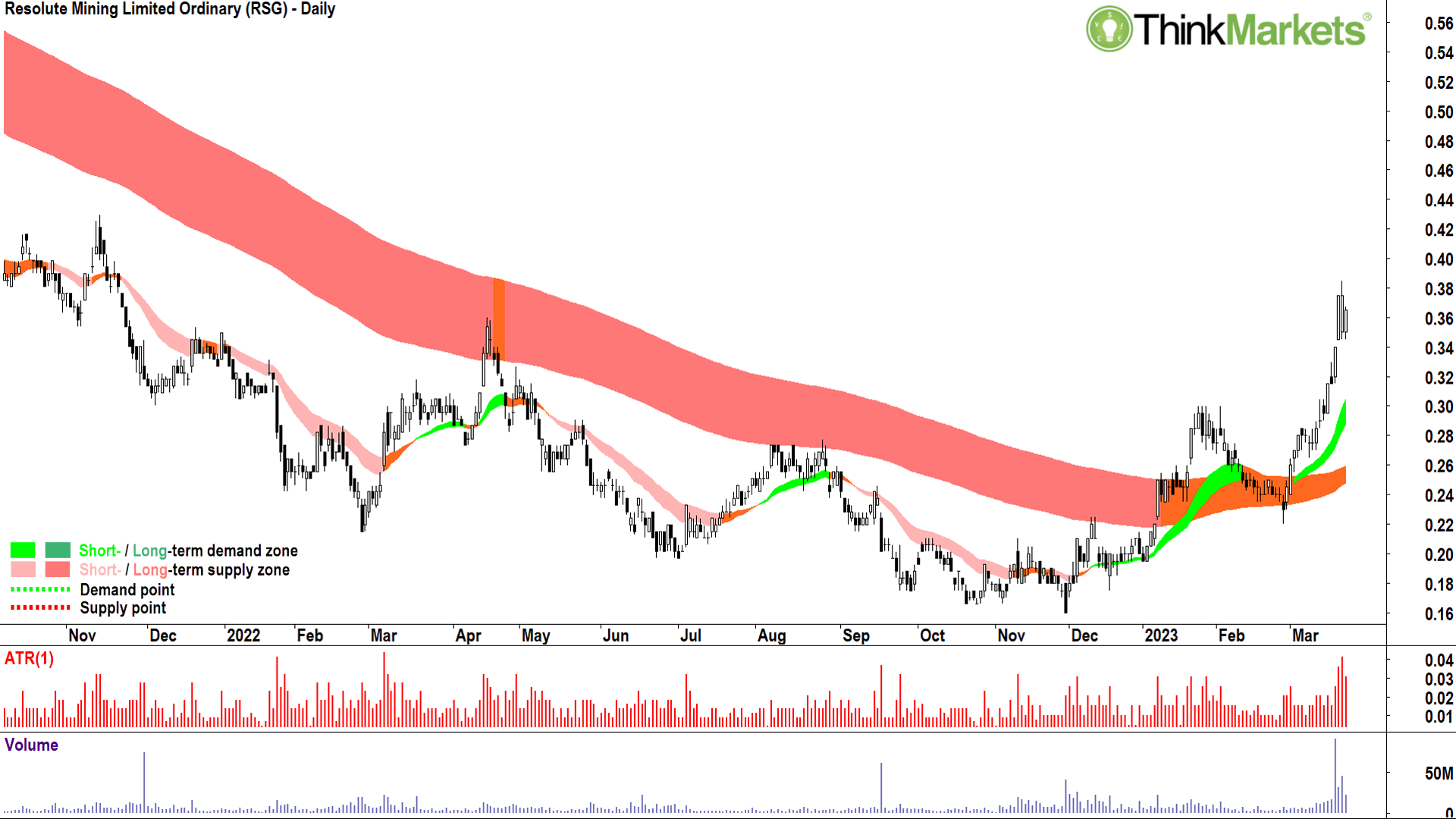
Last but not least, RSG is sitting on some impressive resources/reserves with as much as 11.2 Moz/4.6 Moz in the ground at their two African gold mines in Mali and Senegal. Production-wise its comfortably mid-tier with around 353,000 oz of production p.a. on an AISC of approximately US$1,400.
The RSG chart shows a solid run up through March as the company significantly upgraded their resources and reserves. Like RMS, the long-term trend zone is still amber, but is in the process of transitioning to an uptrend and does appear to be offering dynamic support to price.
The price action is exemplary, with clear separation on rising peaks and troughs. The abundance of demand-side candles are the best on any chart in this list.
If I have one criticism of the RSG chart, it’s that it’s run a little too hard! Preferably, I get to buy a stock showing solid short-and long-term uptrends, with great price action and candles… and which is close to my short-term uptrend ribbon (light green zone). RSG has just pushed a bit too far from its short-term trend ribbon for my liking.
This doesn’t mean I am averse to simply running out and adding some risk right now – I’m not, but I’d rather wait for a pullback first. In this regard, I’ll be watching for some demand-side candles around the old supply zone from the January highs at $0.30.
Bias: Long until a close below the 8 Mar low of $0.265.
Good hunting.
All the best and Ciao a tutti!
The views, information, or opinions expressed in the interviews in this article are solely those of the interviewees and do not represent the views of Stockhead. Stockhead does not provide, endorse or otherwise assume responsibility for any financial product advice contained in this article.
Related Stories


UNLOCK INSIGHTS
Discover the untold stories of emerging ASX stocks.
Daily news and expert analysis, it's free to subscribe.
By proceeding, you confirm you understand that we handle personal information in accordance with our Privacy Policy.